

Hello. My name is James Abundis. I am a graphic and information designer and a technical illustrator. My experience comes from the marketing and news industries. I blend my skills, talent, and experience to design creative multimedia content. Are you looking for a way to creatively market your goods and services? Do you need help conveying your ideas through visuals and design? If so, take a look at my iIDEAS. If you see something you like and would like me to help you communicate your message, information, or ideas to your audience — connect with me.
PLEASE NOTE: This website is under development. Content is being added and edited.
MindNode maps are very informative and clearly document how organizations are related to solving specific aspects of a broader problem. What they are not is very appealing or reader friendly.
“It’s not every day you can do work on topics of great social, political, and economic importance. For seven months I worked for the JustMap Foundation (JMF) then, Pathways to Zero (P2Z), doing just that.
Background: The JustMap Foundation (JMF) is a non-profit organization that uses rigorous analytics to give philanthropists and charitable donors new tools for identifying strategically important — yet frequently underfunded and under-recognized — organizations and initiatives working to make a difference. Our target audiences were wealthy donors and investors.
By mapping out all of the community organizations in Boston targeting underserved inner-city students and identifying the ways they were trying to help them stay in school, JMF was helping advocate for additional funding to help those organizations having the most impact with their programs. The two projects I was involved with were:
I created an interactive PDF user's guide in InDesign to help readers understand how to navigate a large PDF map. A self-guided tour was definitely needed.
Both projects involved documenting the ecosystems of the areas we were analyzing to track the progress of the organizations and companies. By doing so, JMF and P2Z could accelerate their pursuit of a major process or product breakthrough by getting other people to financially support them via donations or investment.
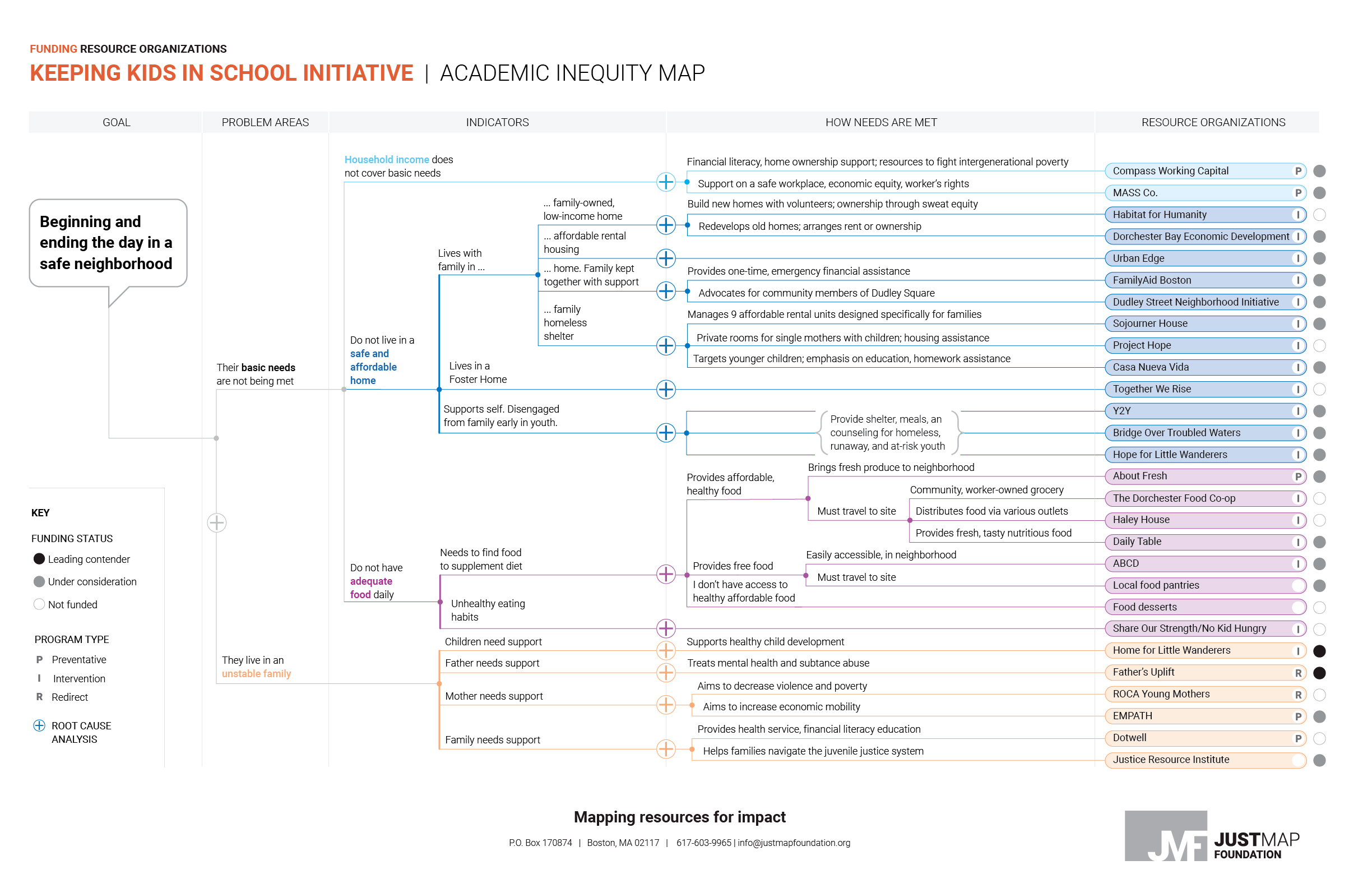
Design role: As a designer, the challenge was to present raw research content that came in the form of a Mindnode map (See Mindnode map, top right) along with relevant graphics and data visualizations to a philanthropic or investor audience. Our finished product was loosely called a “market” or "ecosystem" map and in finished form it was delivered as a PDF file. The maps were dimensionally large and documented how from a central hub (topic area) — organizations or companies in the ecosystem were structured to solve specific aspects of the topic area.
The “Keeping Kids in School” map was created by veteran community activist/researcher Carolyn Grimes and designer Kit Un. I provided some in-production feedback then did some finishing work on the back end. My major input was in creating an interactive “How to read the map” user’s guide in PDF form.
However, I spent a lot of time prototyping the web presense of that project. I understood the value of mapping out, in one place, all of the organizations in an ecosystem working towards a common goal. However, delivering that information via a PDF where we might ask the viewer to pan and zoom in and out did not seem like a reader-friendly approach to deliver our content. Plus, we had an underdeveloped website that needed more content and to be fleshed out. So I labored with how to deliver our very detailed, large map to a digital audience in a digestible format.
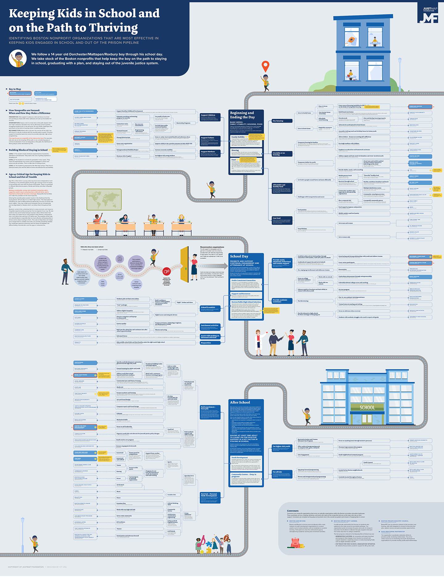
FINSIHED MAP: The education ecosystem map followed the journey of a young, at-risk student from the start of his school day to the end. Along the way you can see the various community organizations that were working to keep the student on the right path.
The designer's primary task in this project was to design a PDF map using InDesign as the primary design tool. The map also included a lot of graphics and data visualizations to highlight meaningful trends. For JMF, these trends represented indicators from "root cause” analysis of specfic problem areas like what happens when a child goes to school without eating a healthy breakfast. Those indicator graphics were created in Illustrator. When I prototyped one node or branch of the education map I was looking for an intelligent way to present the content visually. Also, how to present it on the web for various media (cellphone, tablet, and desktop). The latter objective was challenging.
In a user interface prototype I designed (see below), I used a hide/show coding technique to showcase various root cause analysis graphics. By clicking on any of the plus signs, the reader could see any related graphics in a modal. A modal is a visual where the graphic fills the screen so it can be easily read and studied. This effect is activated by clicking on a target: the plus sign.
In the two graphics illustrated below, I was also trying to establish a visual style. After designing a few graphics that used various graphic forms (i.e., pies, feverlines, bar charts, etc.), I would later create a graphic style guide of every graphic form known to mankind to guide future JMF information designers.
NODE MAP PROTOTYPE: After mapping out just the "Beginning and Ending the Day in a Safe Neighborhood" node (branch) of the Education Map, it looked more organized. But, to me, it also looked hard to digest, follow.
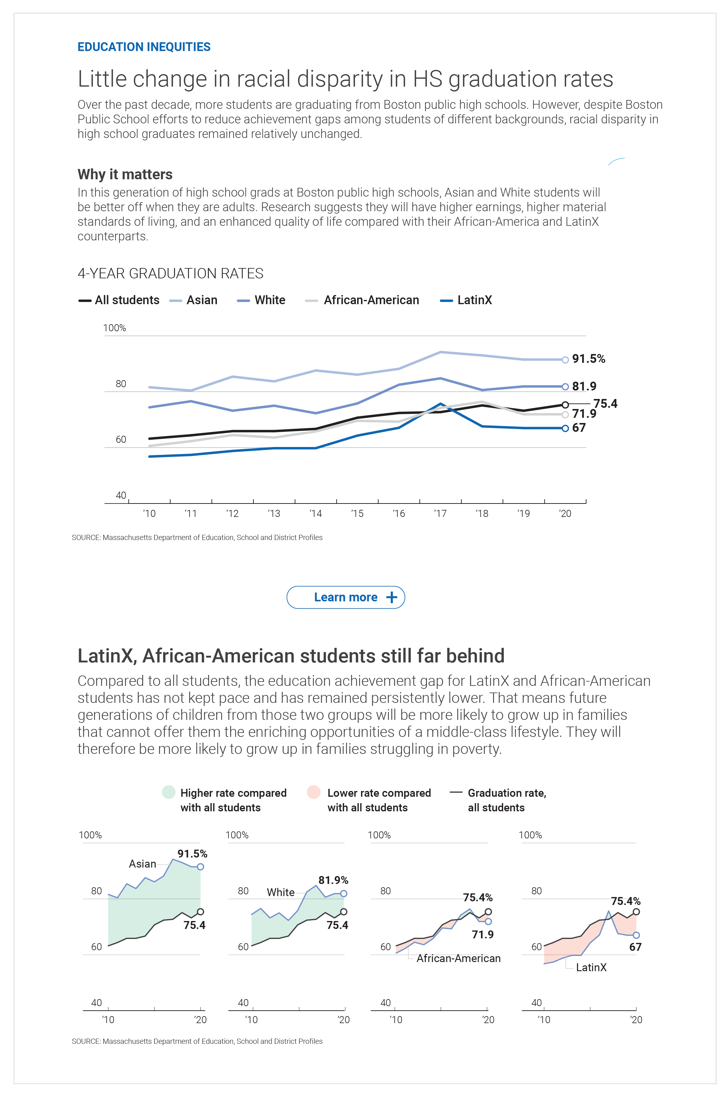
ROOT-CAUSE ANALYSIS: Tracking the Boston Unified School District's 4-year graduation rate by race and ethnicity highlights the trajectory of the most-vulnerable students in the district.
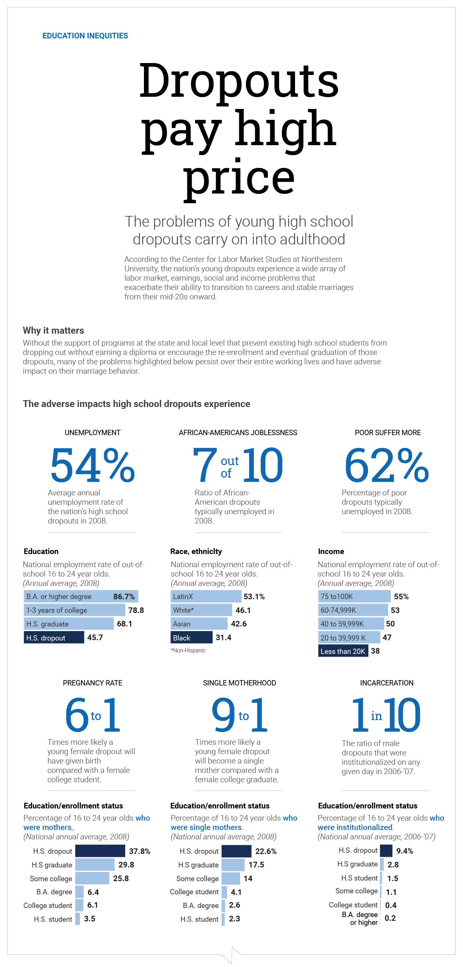
INDICATORS GRAPHIC: The negative outcomes are many when high school students drop out.
There is a considerable body of social science research on each stage of a child's development from early childhood to adulthood. At each stage, a variety of indicators have been observed that gauge whether a student is on or off track in their development. Reading from left to right on our timeline, birth to adulthood, the top half of the visual provides simple behavioral outcomes indicative if a student is on-track to experience academic, social, and economic success. On the bottom half, I show negative indicators. Again, by clicking the plus signs, readers could get detailed analytics on each metric delivered in a visual/graphic form.
What is a fascinating experience from this UI device, as readers study the negative indicators from birth, they can get an general idea on the likelihood the child will graduate from high school. The cumulative negative impacts a child experiences in their young lifetime is a good indicator of their future academic and economic success.
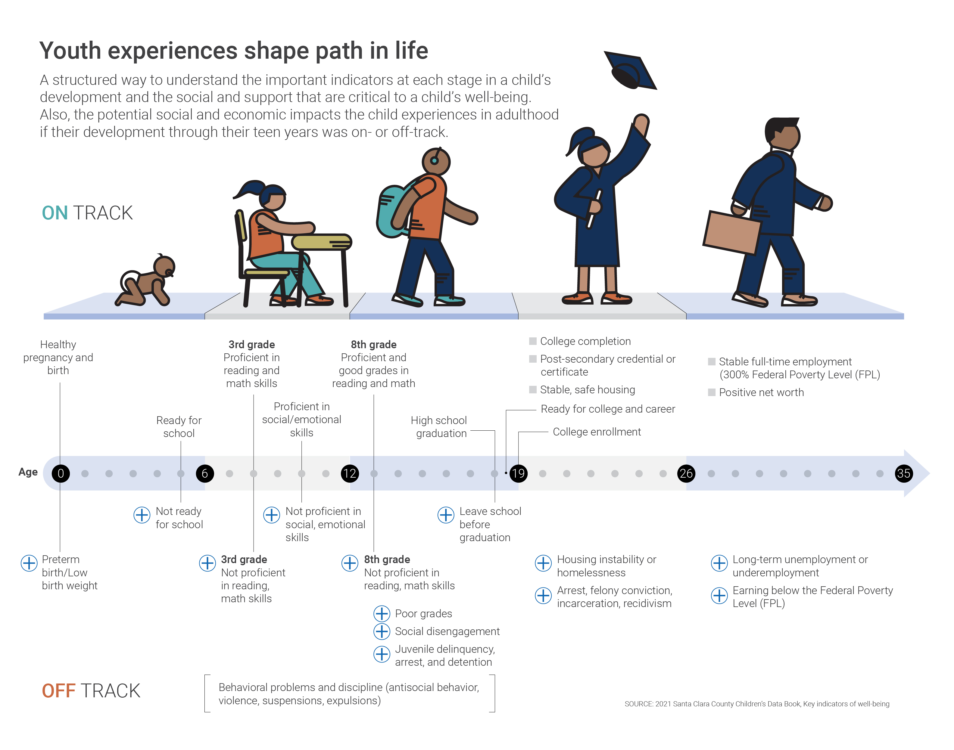
A user-interface protoype showing an alternative way to learn whether a student is on- or off-track in their life development.
I broke down my education map prototype into two parts: a group and an individual profile. What was in each:
Protoyped in the single profile are just those organizations JMF was considering for funding. The profile showed:
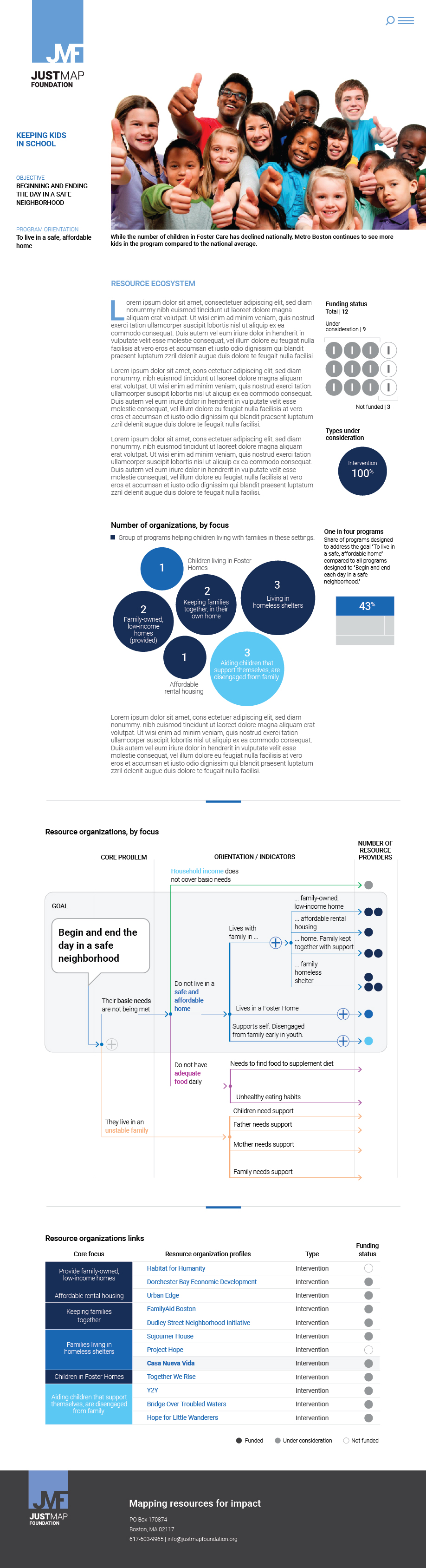
GROUP PROFILE: The page was designed to look at a grouping of non-profit organizations that targeted providing the same services to meet a particular need.
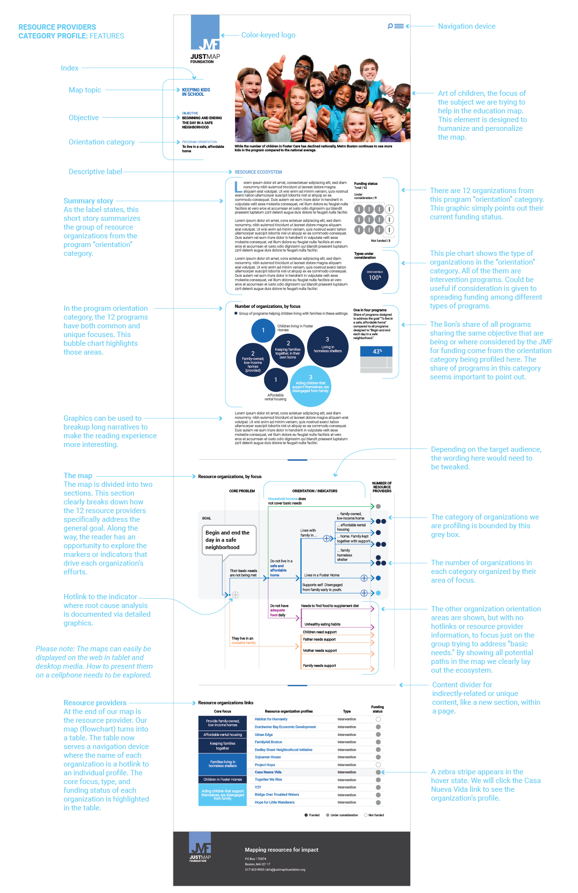
A roadmap of the features found in the organization groupings page.
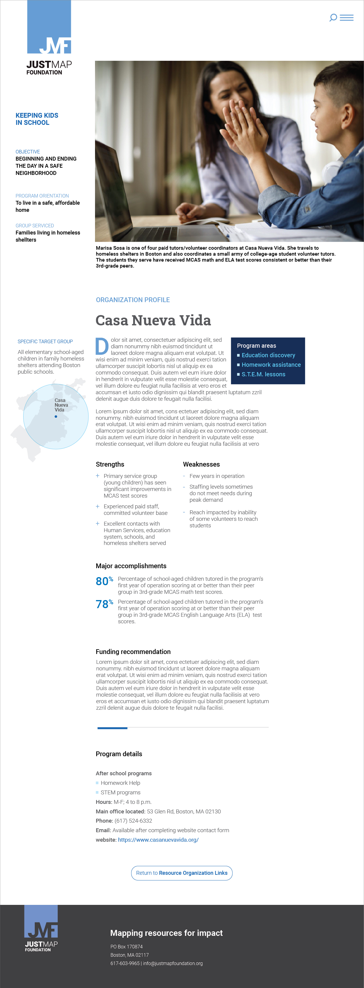
ORGANIZATION PROFILE: This web page looked at how one organization in a group of similar organizations is performing. The emphasis here was to assess whether the organization profiled was having an impact in the community they served.
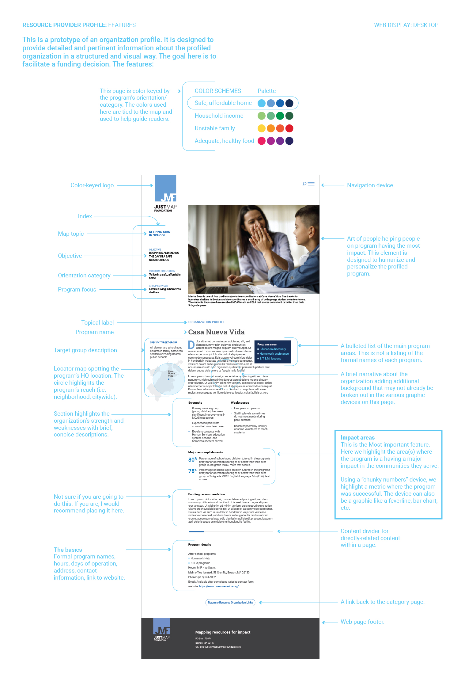
A roadmap of the features found in the organization profile page.
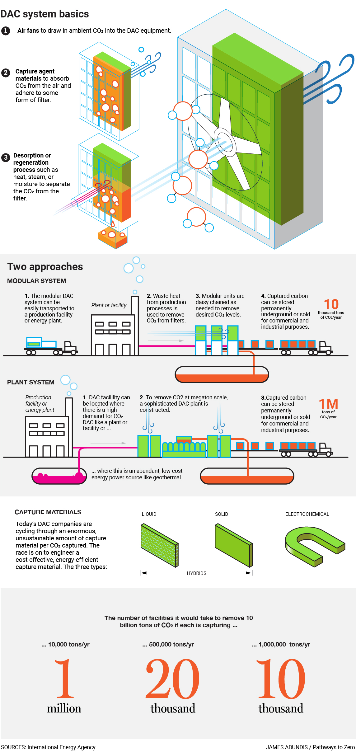
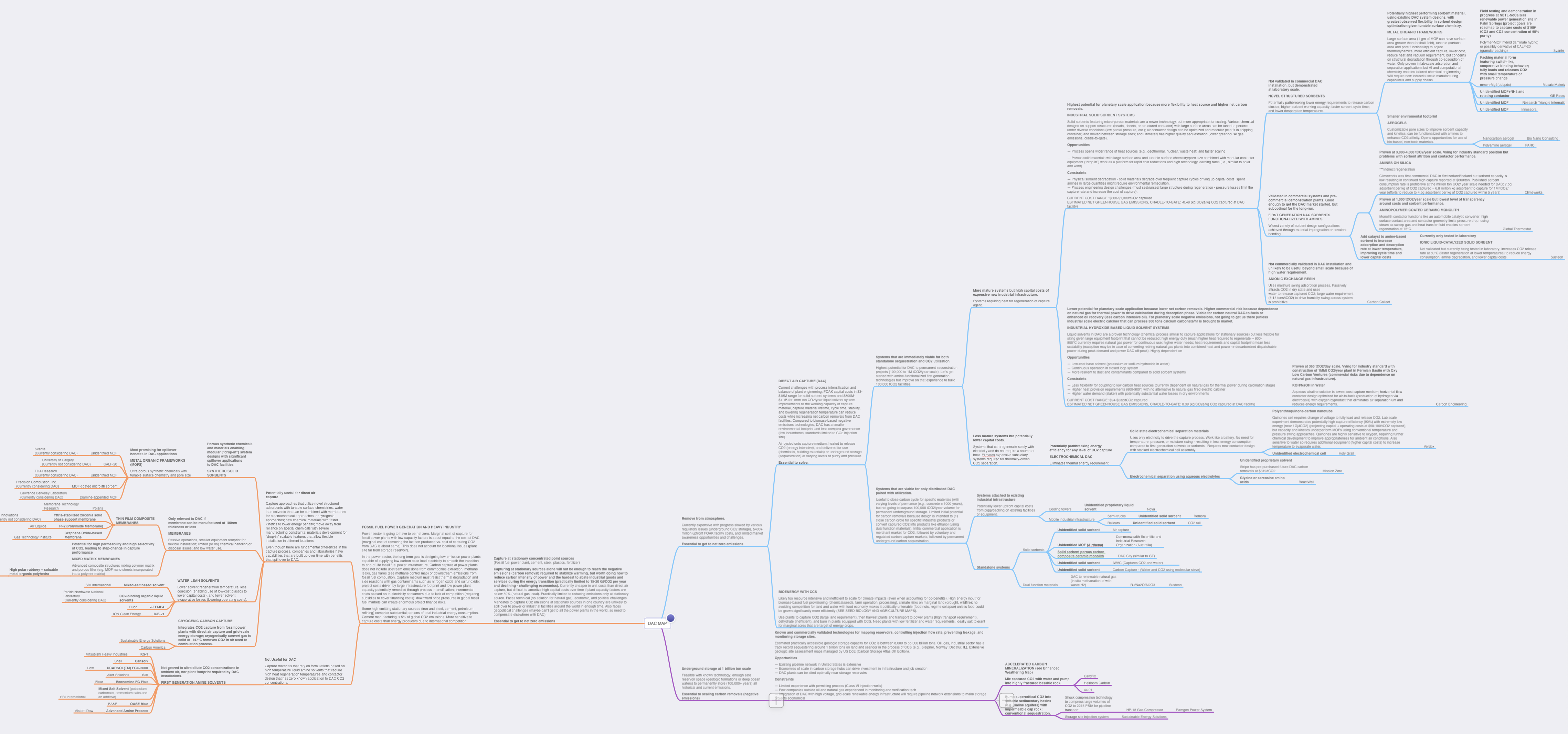
EXPLAINER GRAPHIC: Direct Air Capture (DAC) is an emerging technology that literally sucks CO2 emissions right out of the air. Many graphics like these were created to explain complex technologies simply.
After playing a supportive design role with the JustMap Foundation (JMF) education map project, I was dispatched to work on a map on global warming technologies. I began working specifically with Mitch Cook, who received a PhD from MIT in urban and regional planning and international economic development. I went from a focus on educational inequities in Boston schools to looking at how novel technologies could help humanity survive the ill effects of global warming. That was pretty cool since I feel very strongly about both subjects. Though I started just helping design a map project for JMF, this new direction soon evolved into creating a visual branding program for a new startup, Pathways to Zero (P2Z). Doing design work for a startup formed to help save the planet was exciting work.
My primary charge was to create a map on one pivotal greenhouse gas reduction technology — Direct Air Capture (DAC). I was not familiar with the technology at the time, and many others I would soon be exposed to, so I dove in and began researching greenhouse gas reduction technologies and major global warming warning signs like rising temperatures and sea level rise from scientific studies coming out of the United Nations Intergovernmental Panel on Climate Change and other private organizations and federal climate-related agencies.
JMF and P2Z were both non-profit organizations. JMF was targeting philanthropist; P2Z, investors. However, at the time, it wasn't clear to me what type of investor we were targeting: Institutional, private, or both. Each was a different marketing persona.
Doing work for startups can feel a bit wild at times and can make one uneasy. You know, the feeling one gets before riding a roller coaster. It's a dynamic environment where priorities change rapidly, the mission seems to ebb then flow, sometimes creep, and there is constant experimentation. This was my fourth experience with a startup so I had strapped on my seatbealt and adjusted my mirrors before I started my creative vehicle.
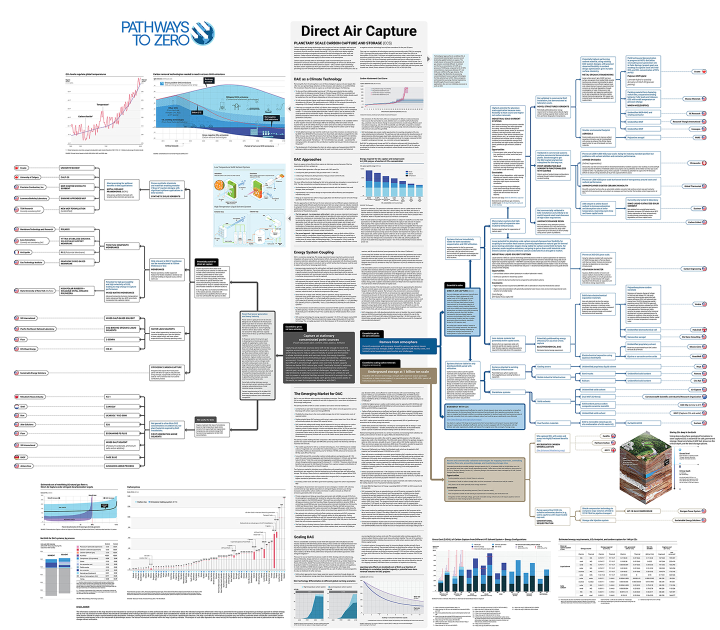
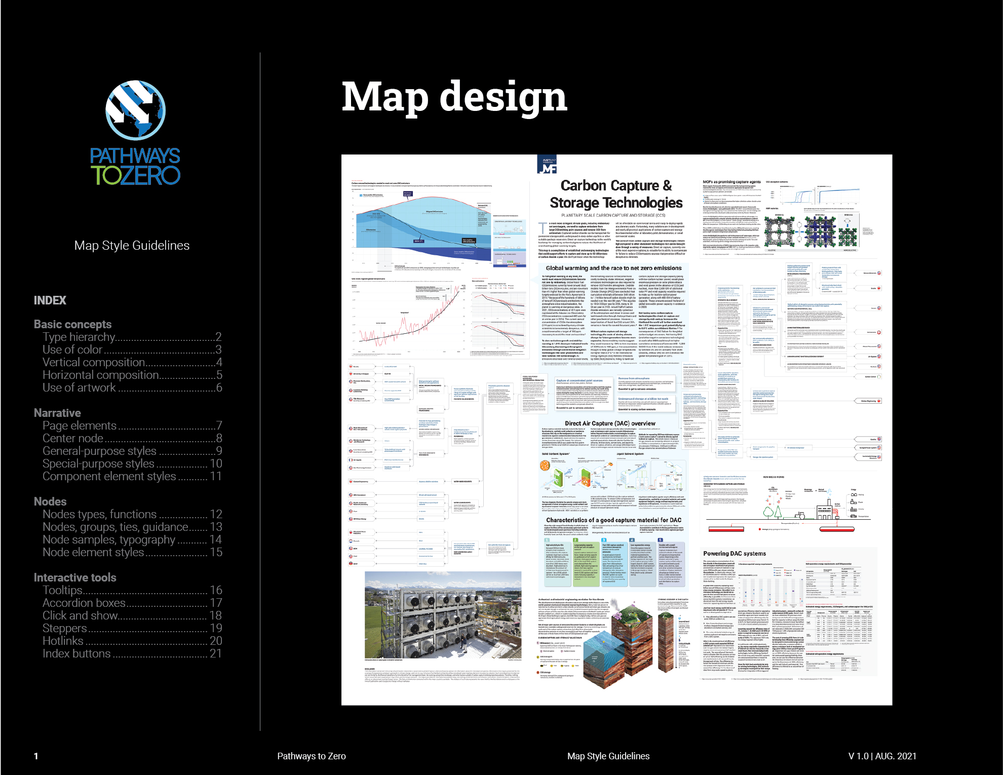
DAC MAP: This map shows that last bit of design work I created for the Pathways to Zero project. Please note: the resolution of this graphic has been scaled down to make its contents unreadable.
While I continued to generate weekly iterations of the DAC map, I stepped back and above that work and took a bird's-eye view on what we (P2Z) needed. We weren't just creating one map — we would be creating many, with many graphics. We were also creating a new product, a new brand. So, I simultaneously worked on some fundamental things we would need:
General style guide
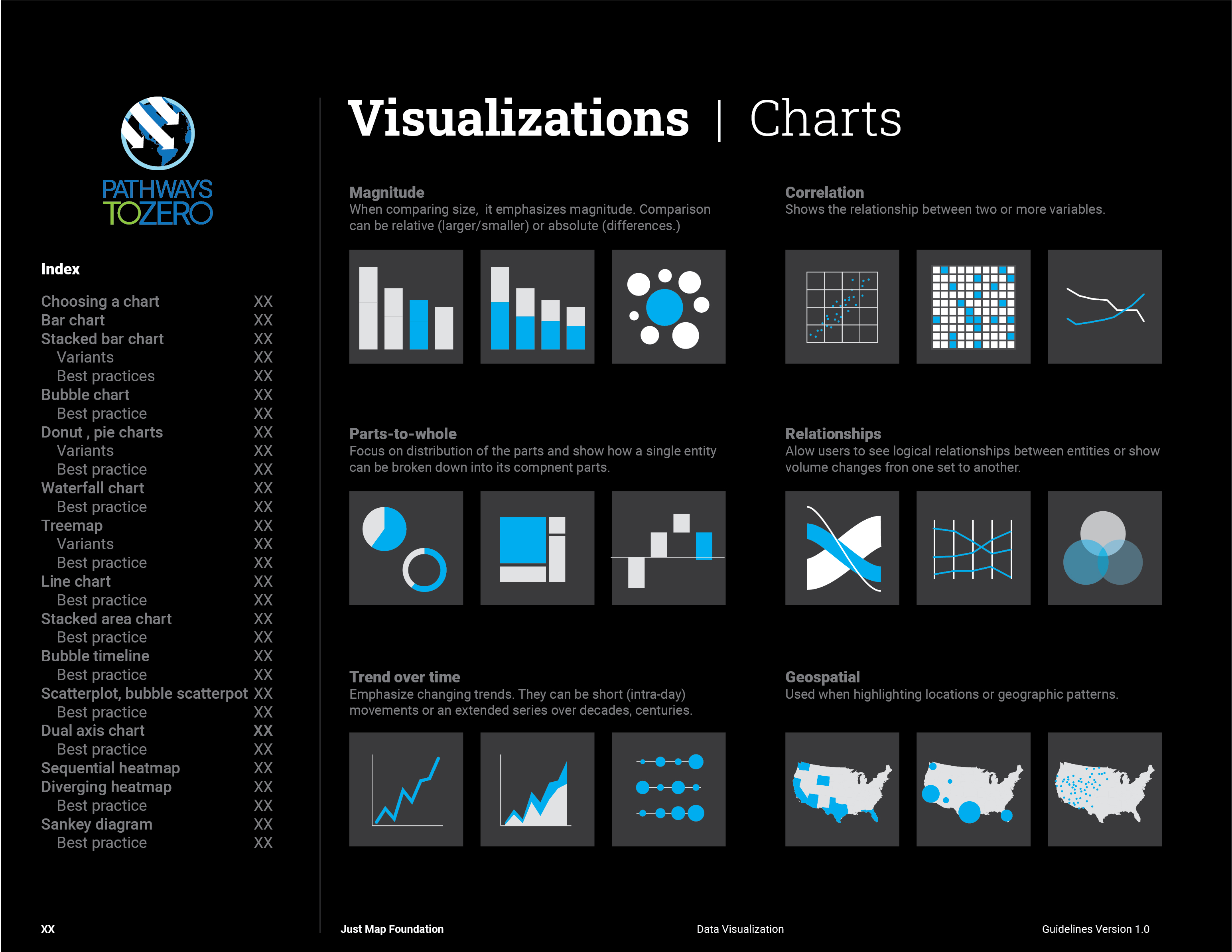
Graphics style guide
How-to-create-a-map guide
There were talks early on about creating a unique website so I broadened my radar and began protoyping pages in Adobe Illustrator and XD. We also started early design work on a logo. Some examples of it are depicted on the protoyped web pages below. We didn't have a budget for artwork so I found free sources or created it myself.
I had anticipated hard-coding the web pages myself but we made a decision to build the website in WordPress so non-technical contributors could easily add or edit web content. Subsequently, I embarked on a learning journey and taught myself WordPress. That was a meaningful experience. I will probably convert this website to WordPress so that it does not take me so long to service.
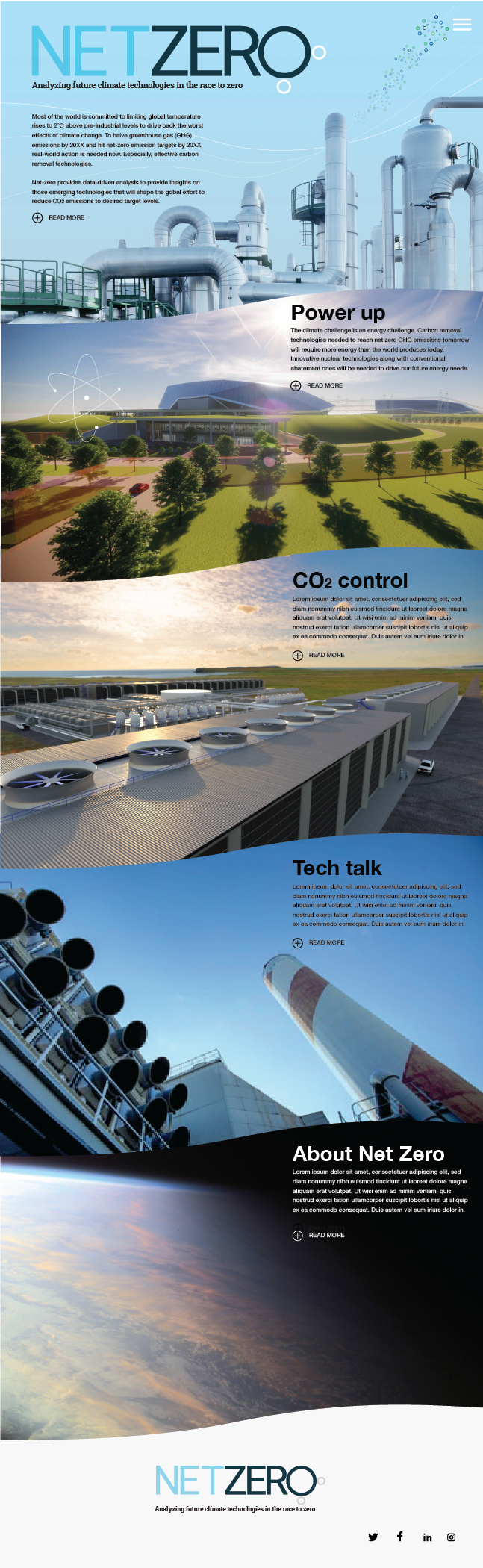
Homepage protoype
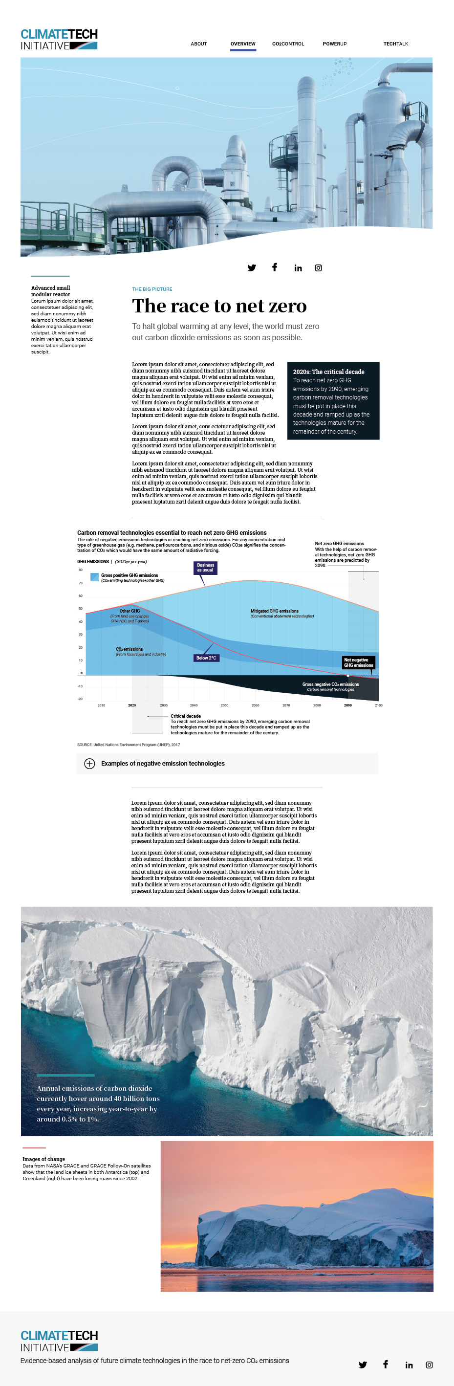
About us/Overview prototype
Global warming is a hot-button topic. According to the Pew Research Center, six in ten Americans view climate change as a major threat to the US. Globally, seven in ten people view it as a threat to their country.
No pun intended but, readers and viewers are warm to the subject matter we were working on. A lot was still unknown at this time like when would we launch the site and how much content would we have at launch. Nonetheless, I wanted to have a series of advertising campaigns ready to publish on various media and social-media channels when we received a green light to start generating some buzz about P2Z.
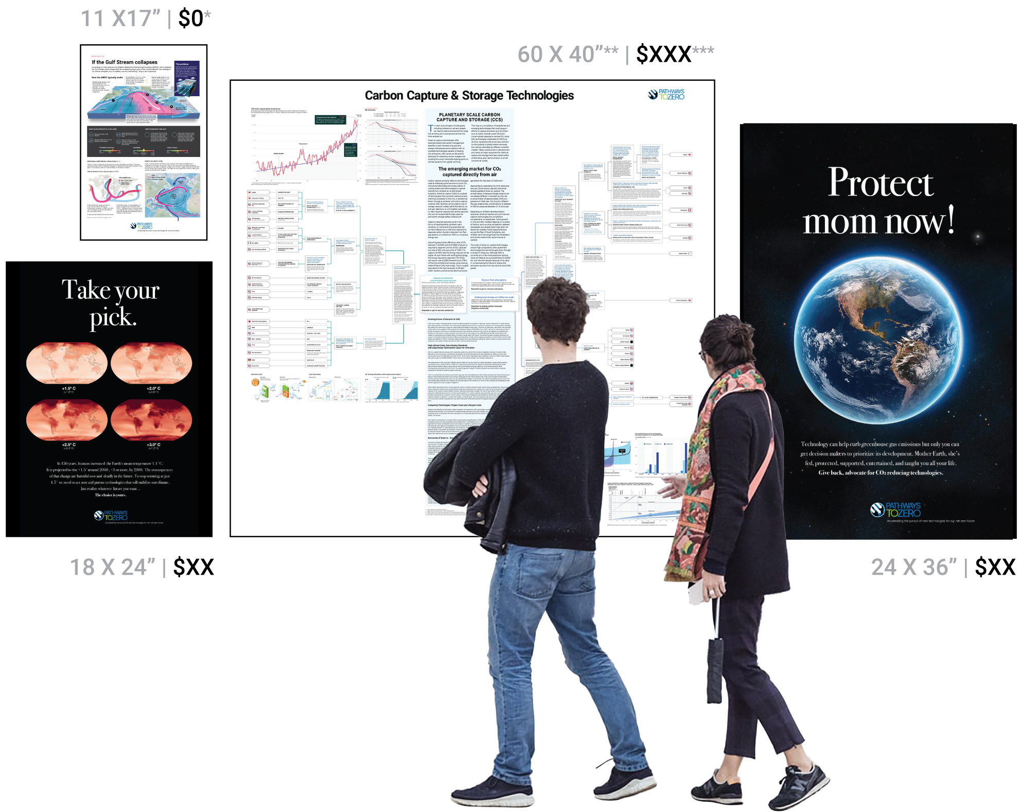
The website artwork created to market the maps, posters, and other sellable P2Z content. Price points had not been established yet so the prototype artwork displays XXs instead of dollar amounts.
I quickly wrote up a bunch of campaigns with appeals to many of the global warming worries people had with a closing slogan “Technology can help.” In the messaging, I presented P2Z as the organization connecting concerned people to the most promising CO2 reduction technological solutions. To accelerate the development of those technologies, readers had to invest in those companies. Thankfully, P2Z, via industry and research experts, had painstakingly vetted those companies for readers. I was simply looking for ways to get readers to view our website.
Rather than protoype out all of the campaigns into the various sizes needed to publish in most media and channels, I created short, distinct messages and presented them in the form of posters. I felt, with a short, well-crafted message and camera-ready artwork, we could easily edit those elements for any media or channel when needed.
The posters were also designed to generate revenue and publicity. To be purchased, the messages had to resonate with potential buyers, all had calls to some form of “civic” action, and had to look good enough that buyers would frame them and display them in their homes or offices. If that happened, our messaging and brand would have long shelf life. That was the plan.
Other poster designs were prototyped that were purely informational and educational. These were designed simply to connect P2Z with the global warming science topics we were researching. We had an opportunity to share that research in graphic form. Since the subject matter was of general interest to the public the information provided was being sought out..
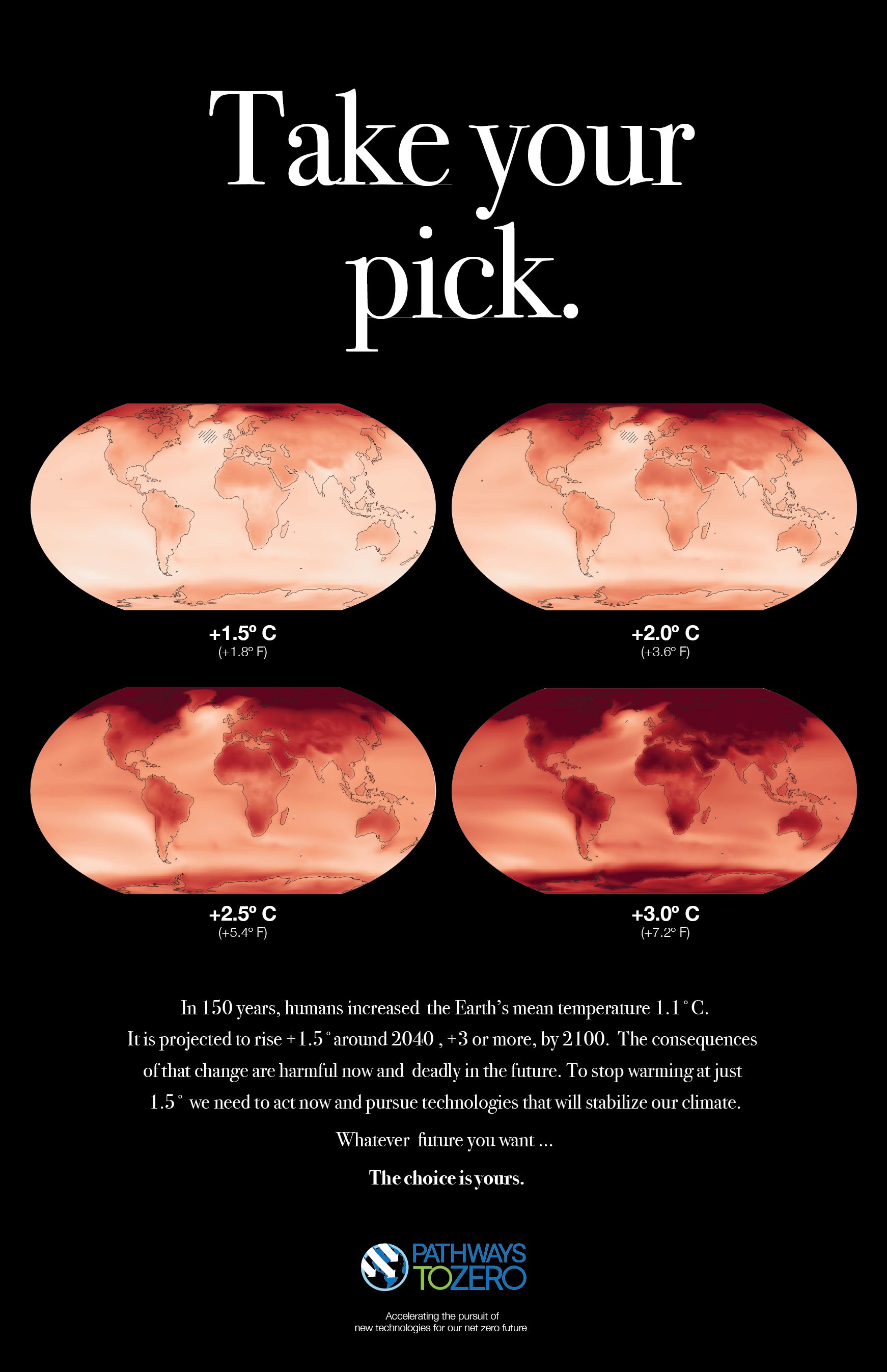
Take your pick.
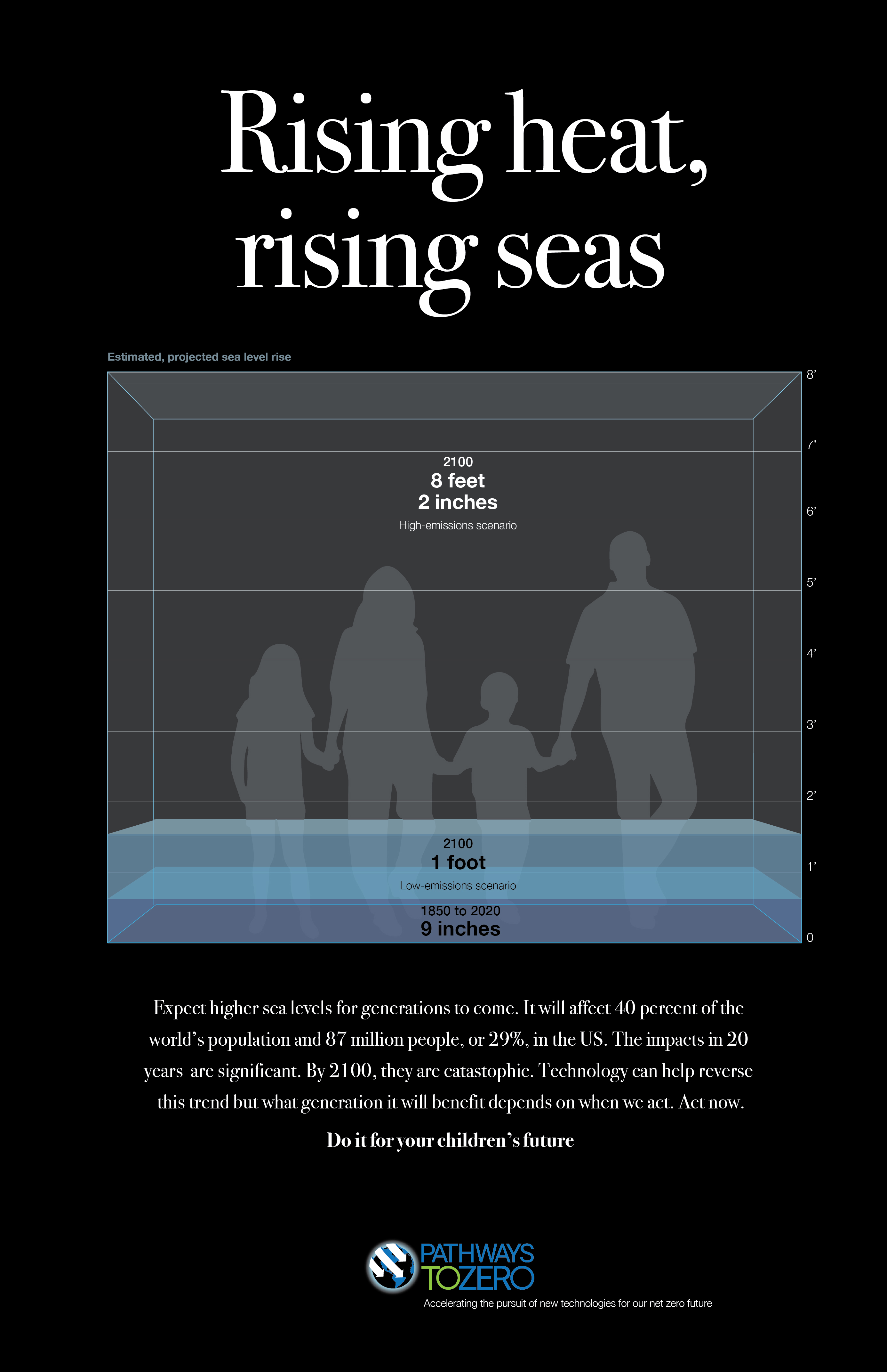
Rising heat, rising seas.
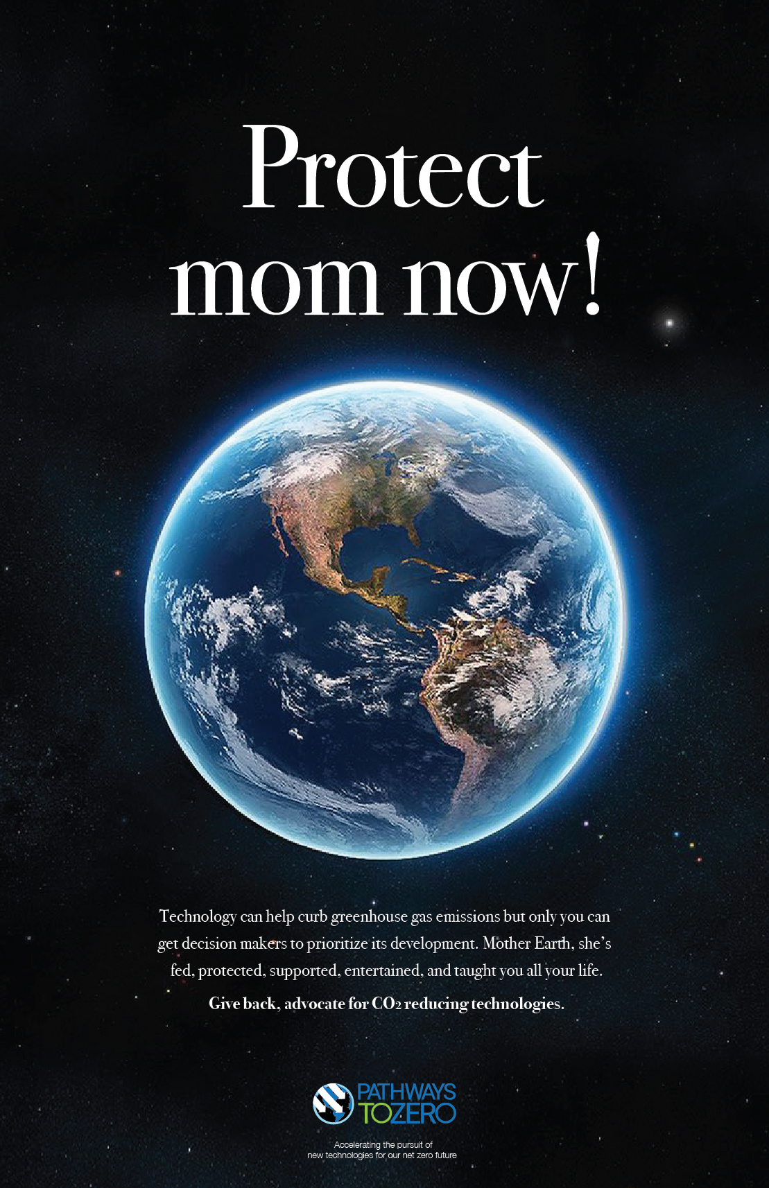
Protect mom now!
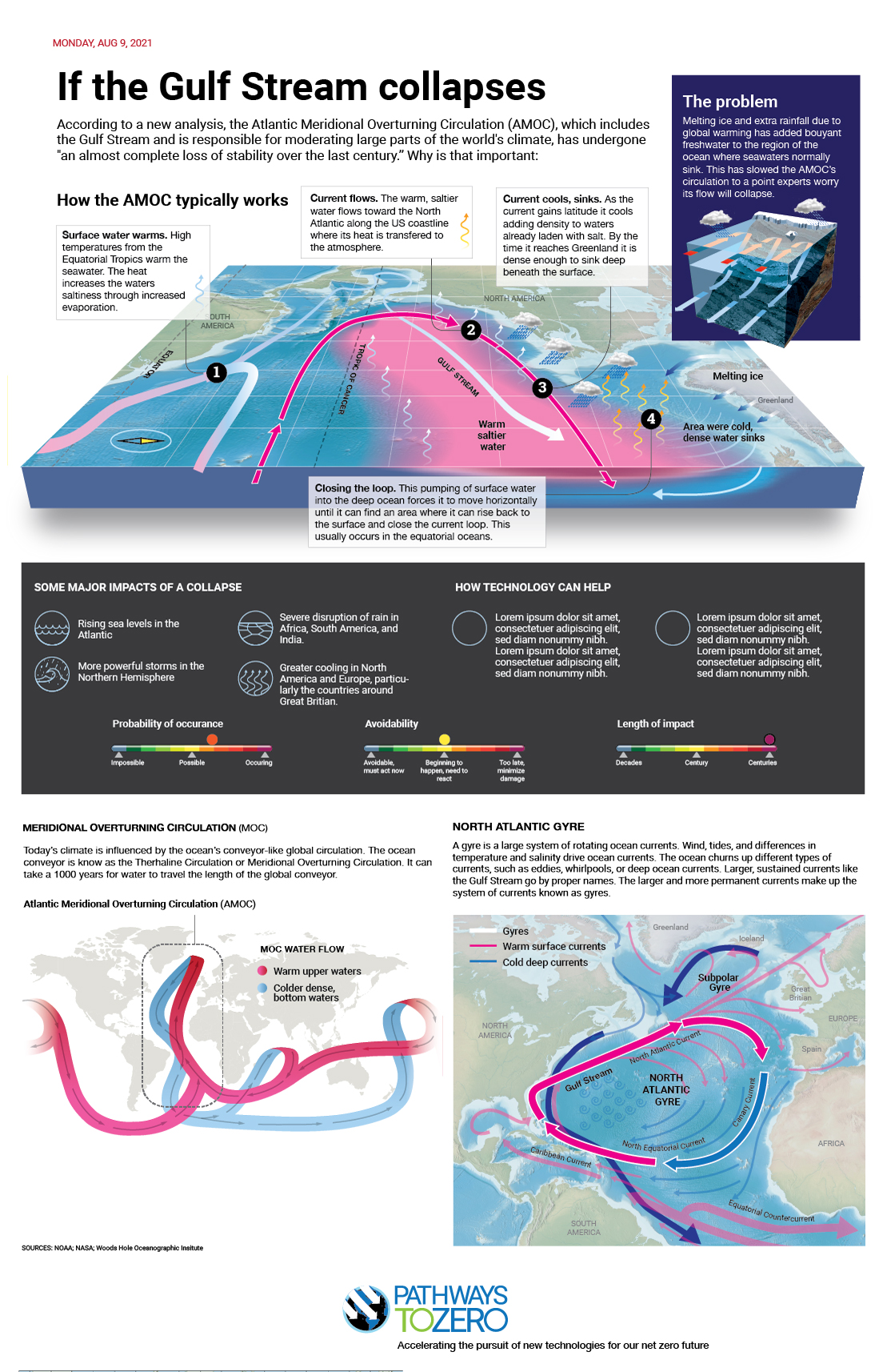
Gulf Stream collapse
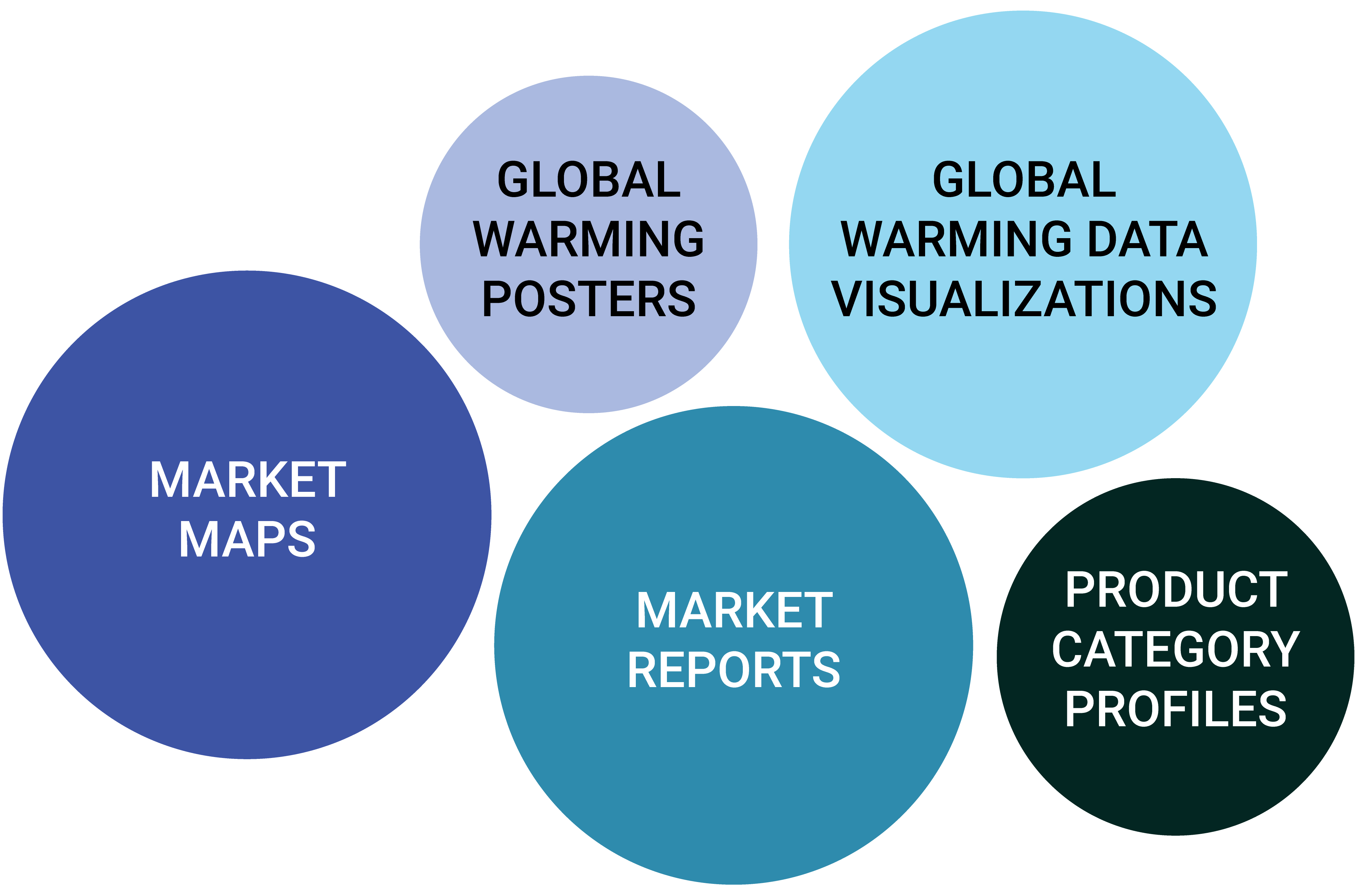
Emerging product mix
After a few months of work, a potential product mix was beginning to emerge. Designing in between map interations, I had knocked out a lot of potential future design work and time was now on my side — my ally.
Ultimately, we did not use a lot of the material I had protopyped. However, having a concrete visual to look at ideas, concepts, and approaches adds tremendous value in the decision-making process.
A few of the things I had protoyped for the website. A lot of corporate bling (not all shown), and some packaging designs in case we started generating research papers or publishing reports.
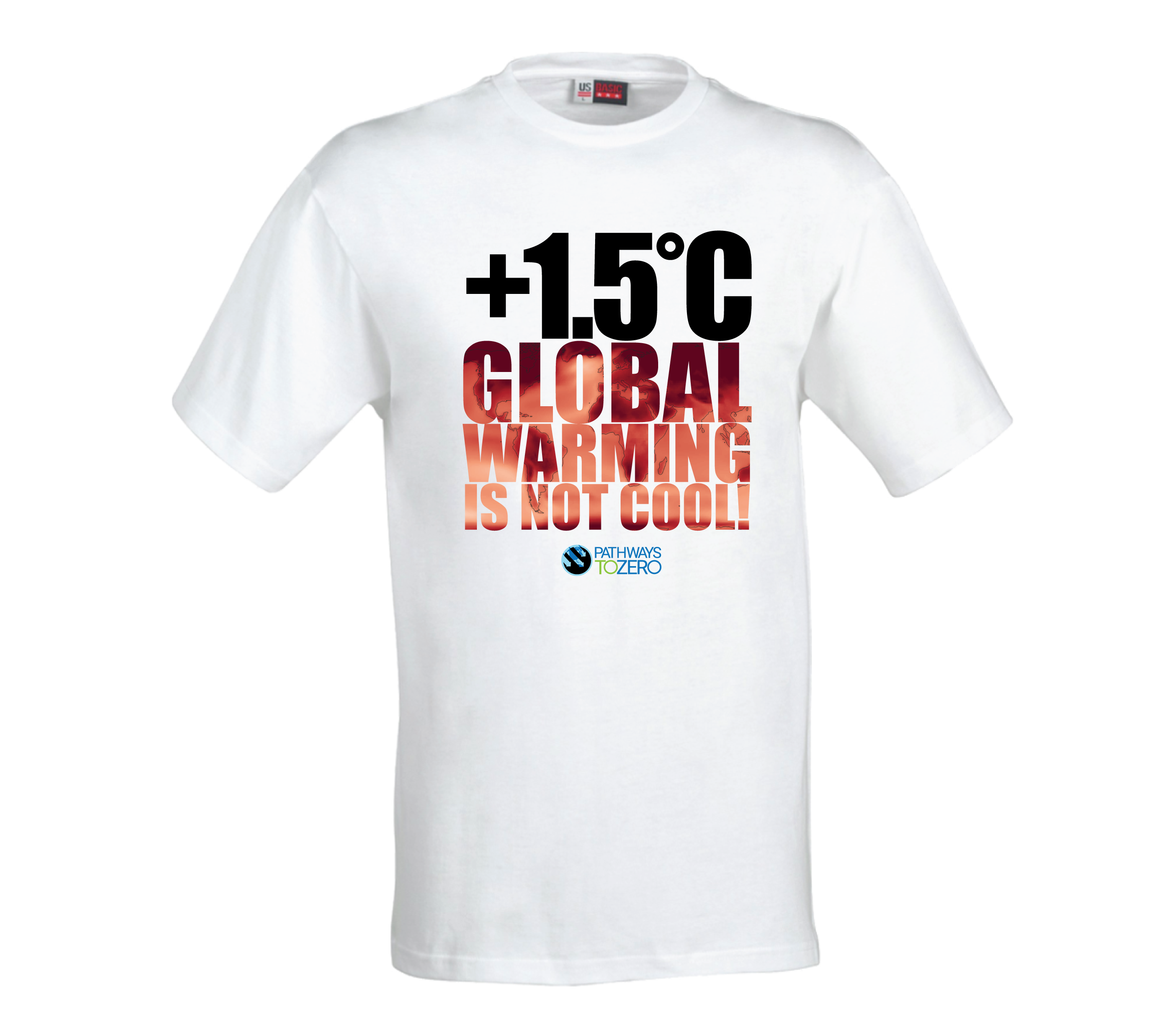
Global warming is not cool!
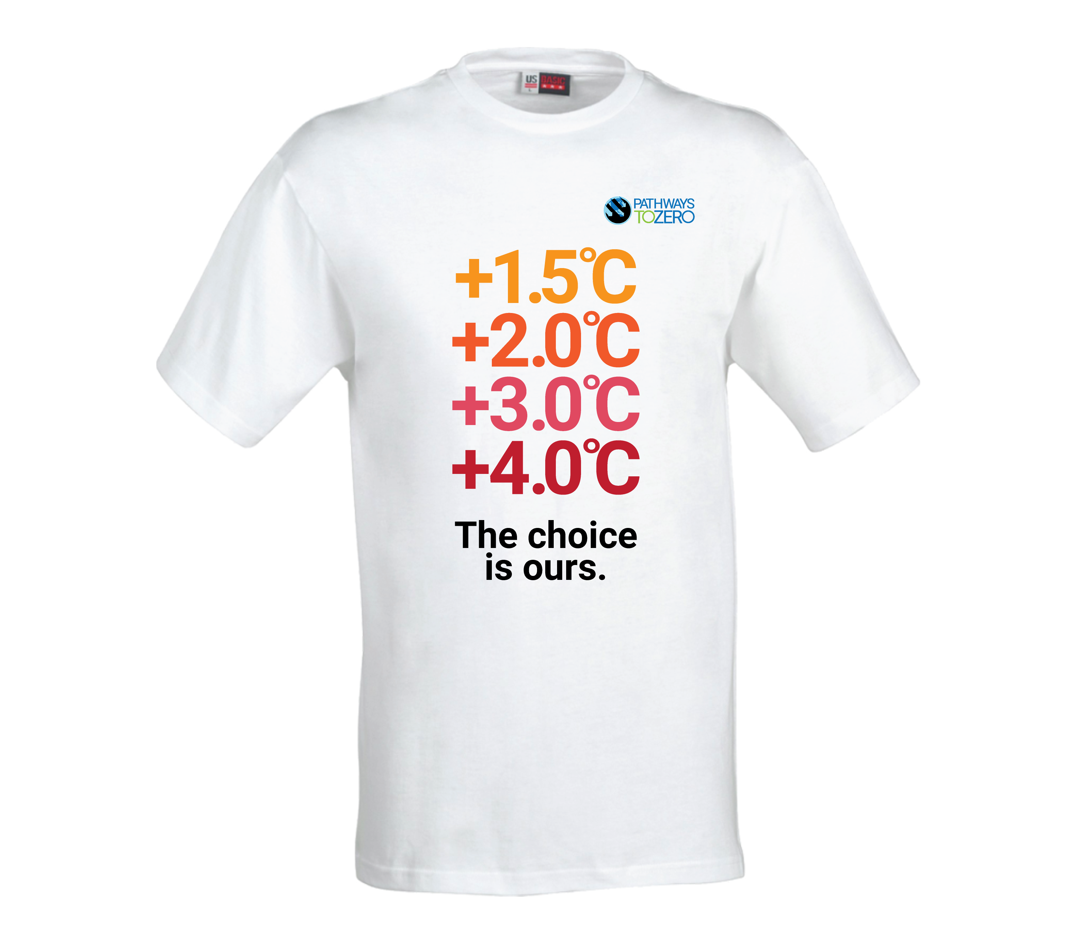
The choice is ours.
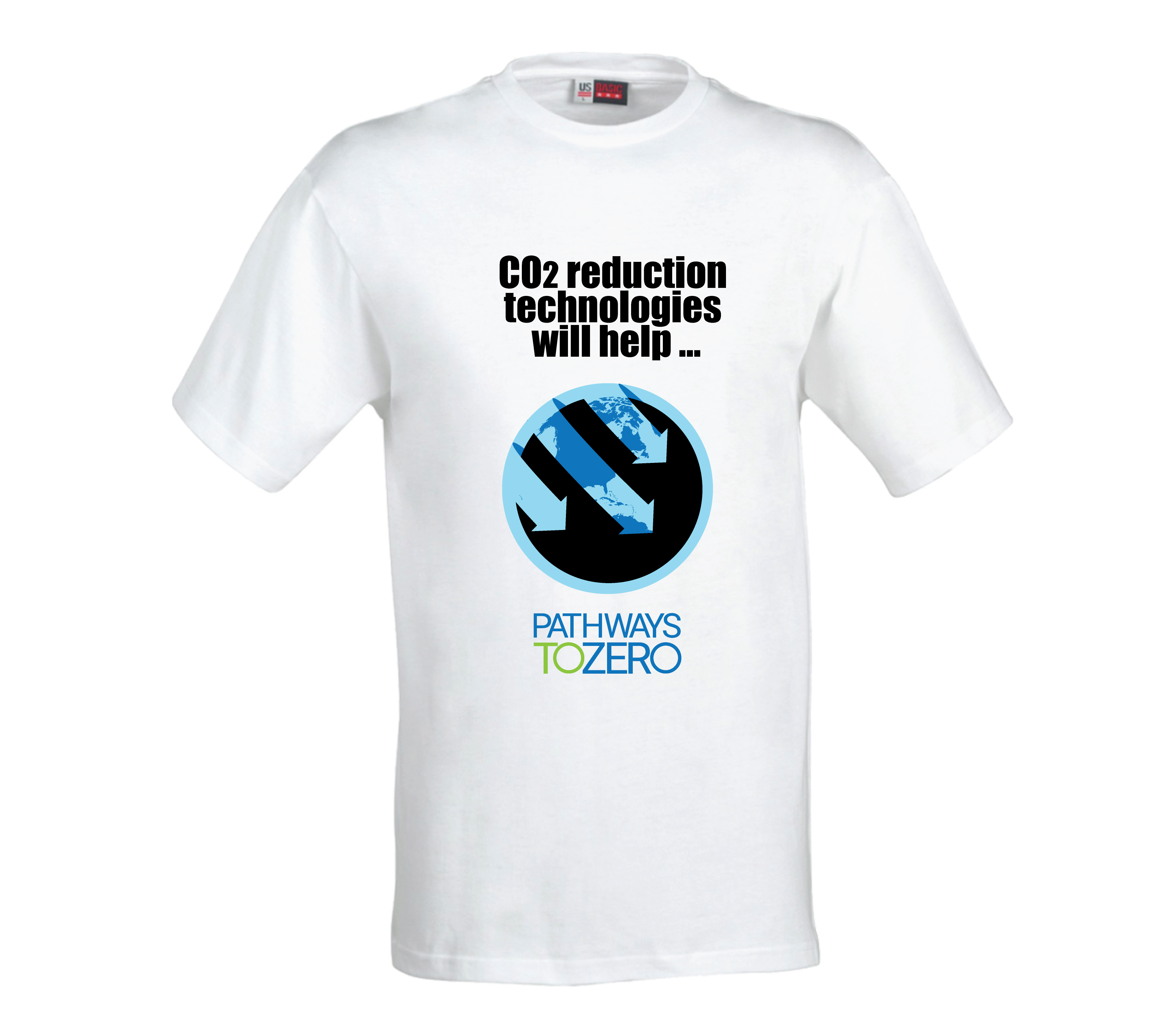
CO2 technology will help
P2Z button
P2Z coffee cup
P2Z reports
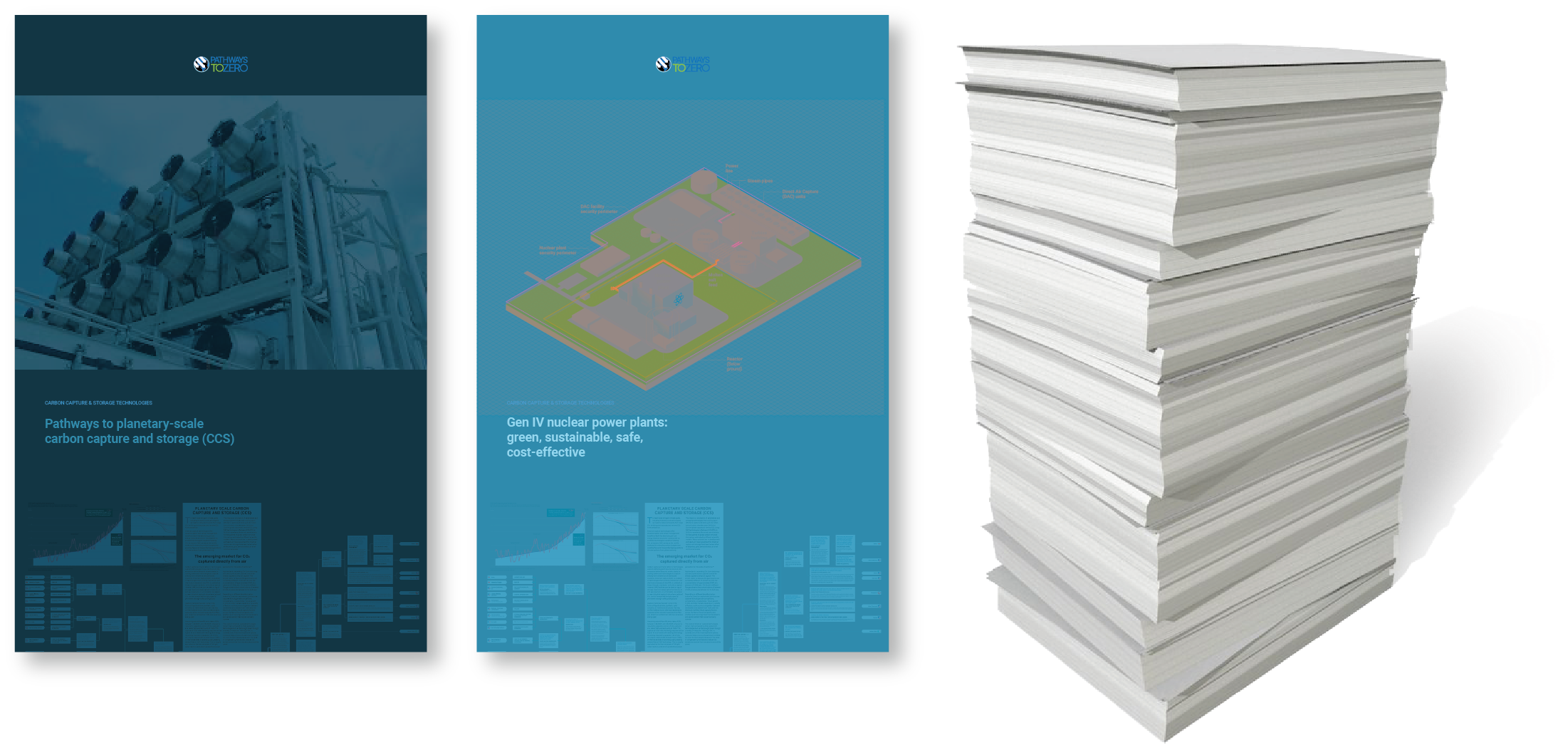
P2Z research papers
After eight iterations, we finalized a logo and logotype design (See below). We had some other interesting and effective designs but the final selection worked well for P2Z's mission.
We worked on the website the final month along with a million other things. The simple Ken-Burns-style video was produced for the home page during the final weeks.
Our home page video is both a welcome mat and a tone setter.
I finished my contract work with P2Z in November. It was an exhilirating ride since we had done so much work in a short period pf time. I enjoyed and miss working with my new teammates Mitch, Carolyn and Kit.
I do hope I land another contract with a start up. I do enjoy roller coasters. To me, the faster the speed, the crazier the turns, the higher the Gs — the funner the ride.