The setup
This slide outlines the main objective, identifies the target audience, and highlights how the proposed work would benefit anyone who must write content on autonomous vehicle technologies.
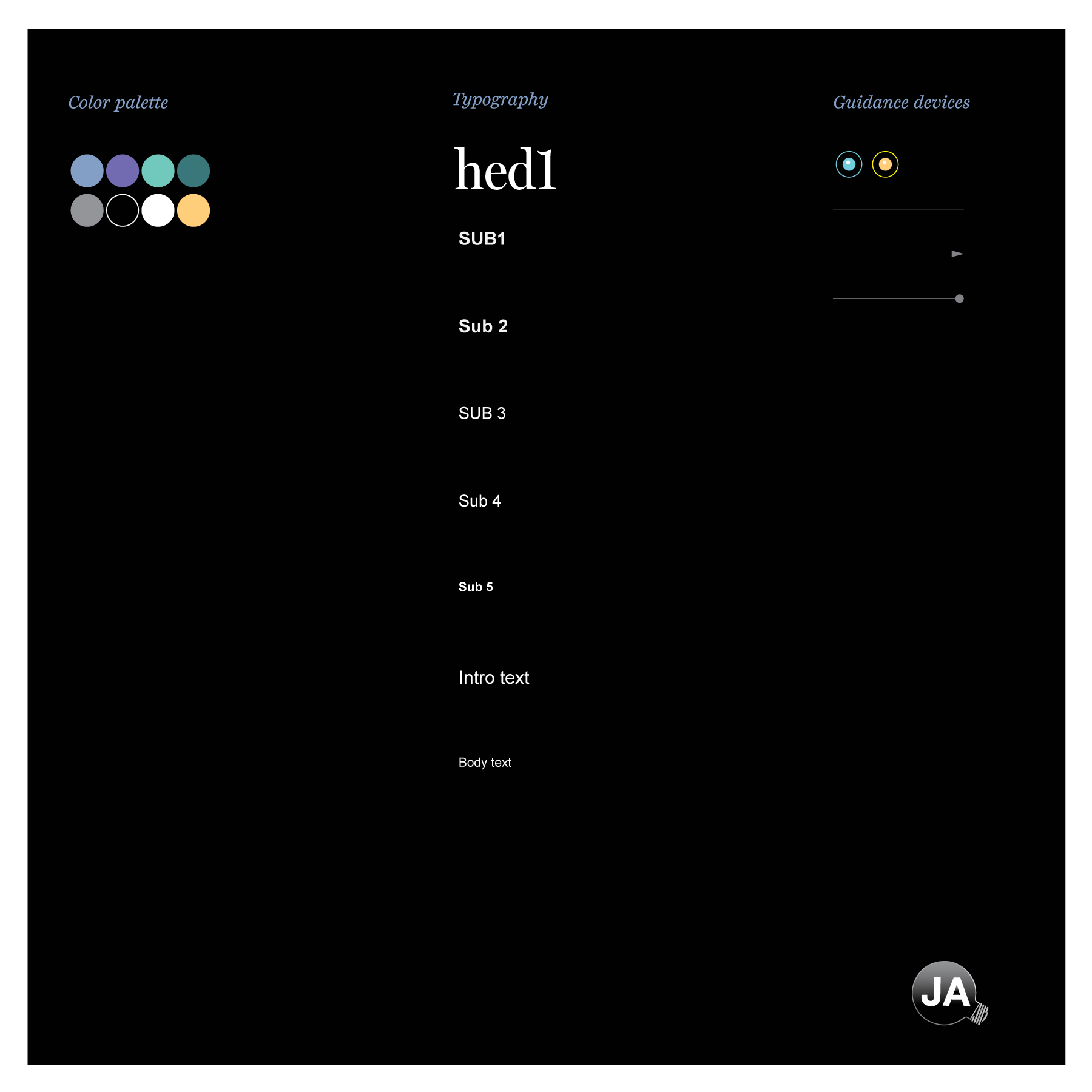
Visual building blocks
The presentation started with general design building blocks. To keep the focus on the writing and whatever art form would be used to illustrate a story, the typography, color palate, and the types of guidance devices was kept to a minimum. (Black type on white or other color backgrounds is not shown.)
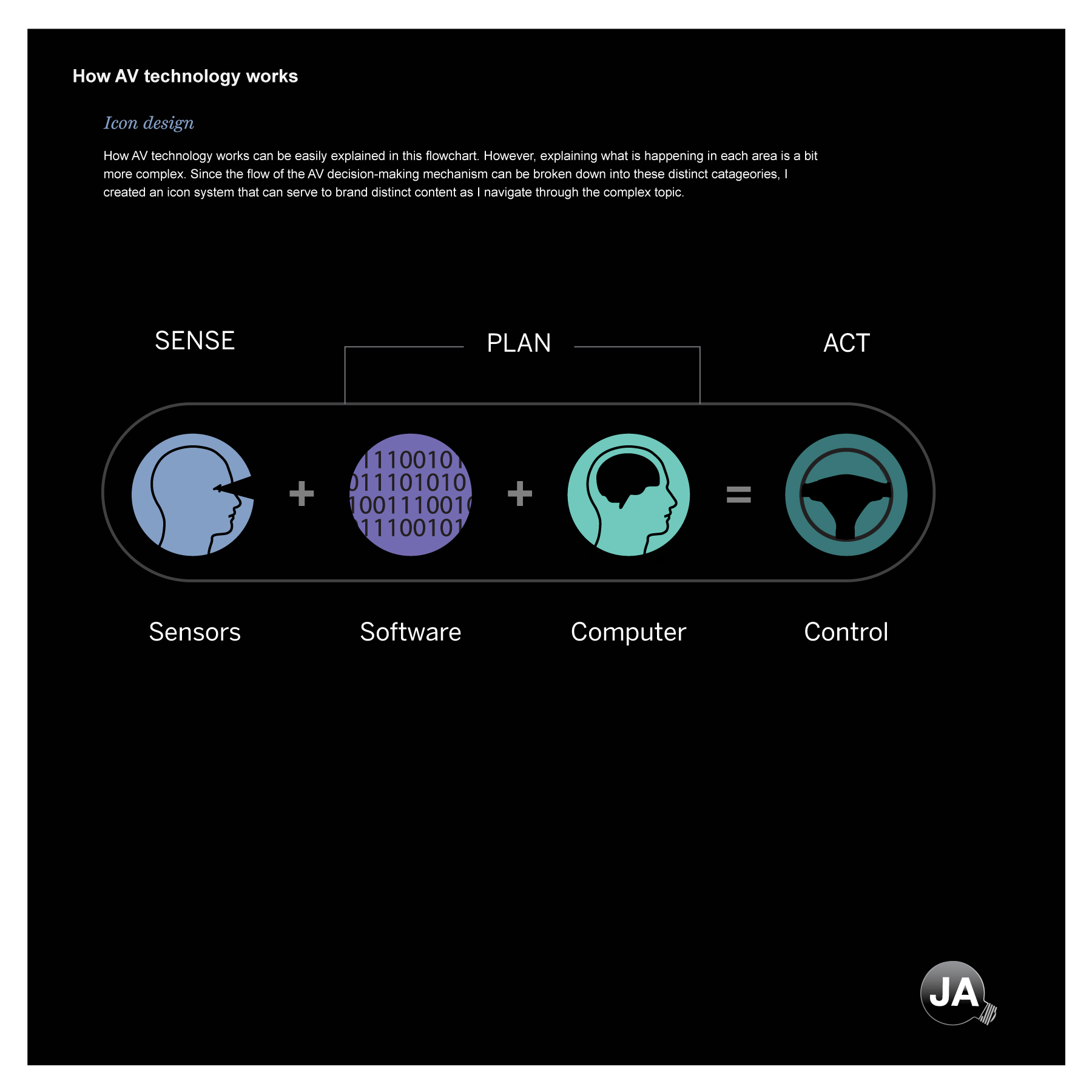
Nut graphic
This was the most important graphic I had to convey. All the graphics that were to follow could be boiled down into these four categories: Sensors, software, computer, and control. Those categories could be grouped in three distinct process steps: Sense, plan, and act. The icons were designed to suggest they could be used to brand a particular type of story.
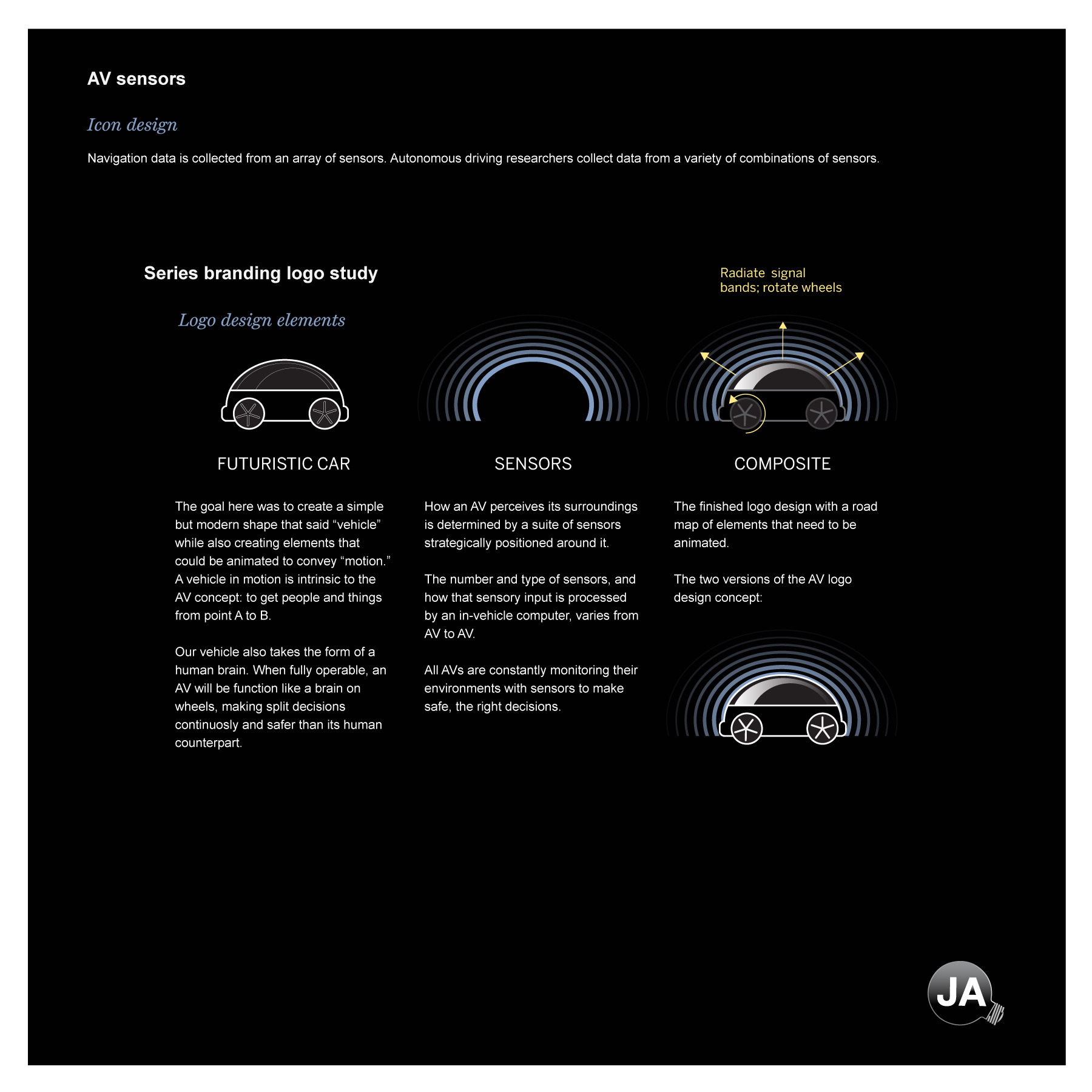
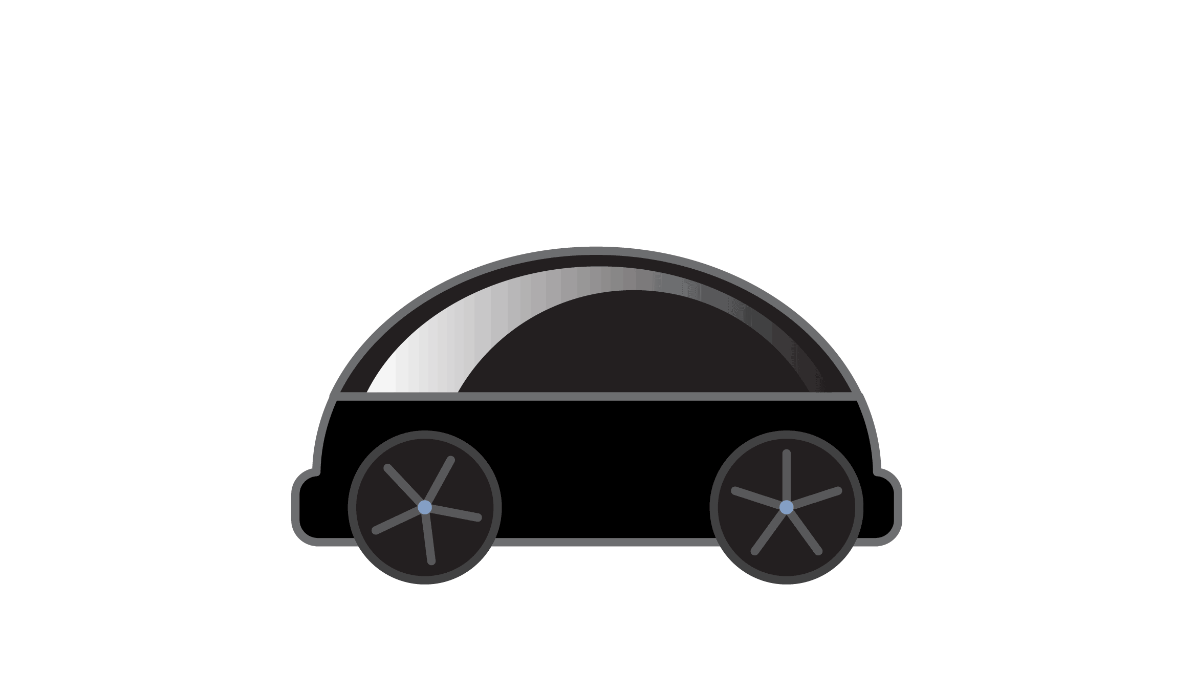
Establishing a visual brand
Sensor selection was a key part of the product. How they are used to control a vehicle is the other. This visual attempted to integrate how those two elements could be merged into a simple but representative icon that would capture the essence of an autonomy company's research endeavors.
Branding via a logo
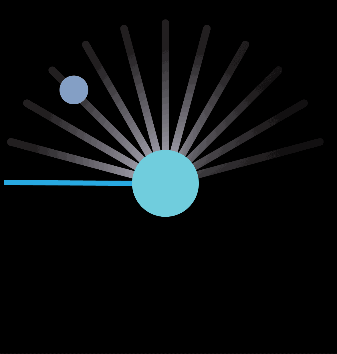
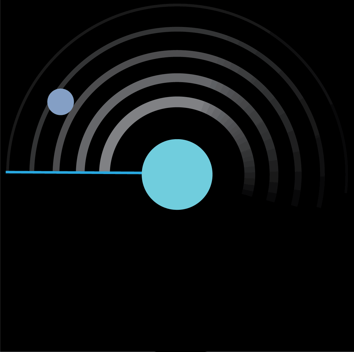
In this panel I demonstrated how animation could be used to reinforce the desired messaging into the logo design. The key words used to shape the logo were futuristic, sensing, motion, and vehicle. In the prototype, I separated the sensors from the moving vehicle to emphasize those two key attributes then combined them into a final design.
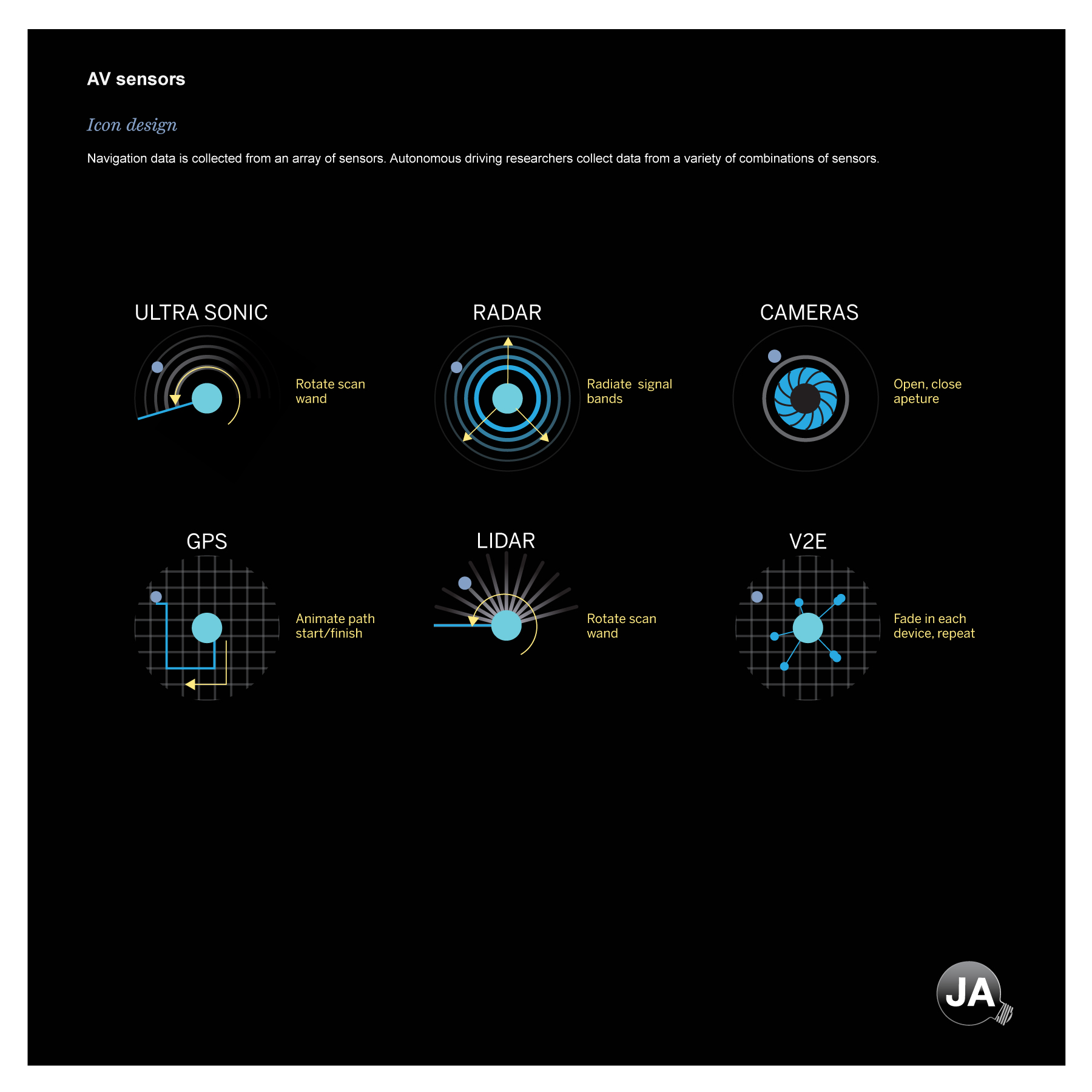
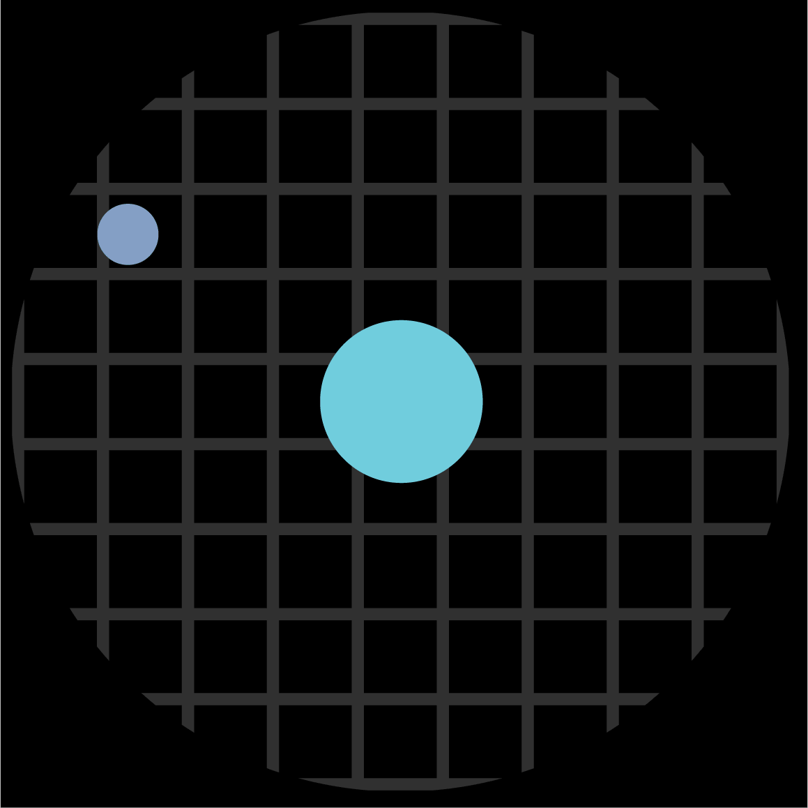
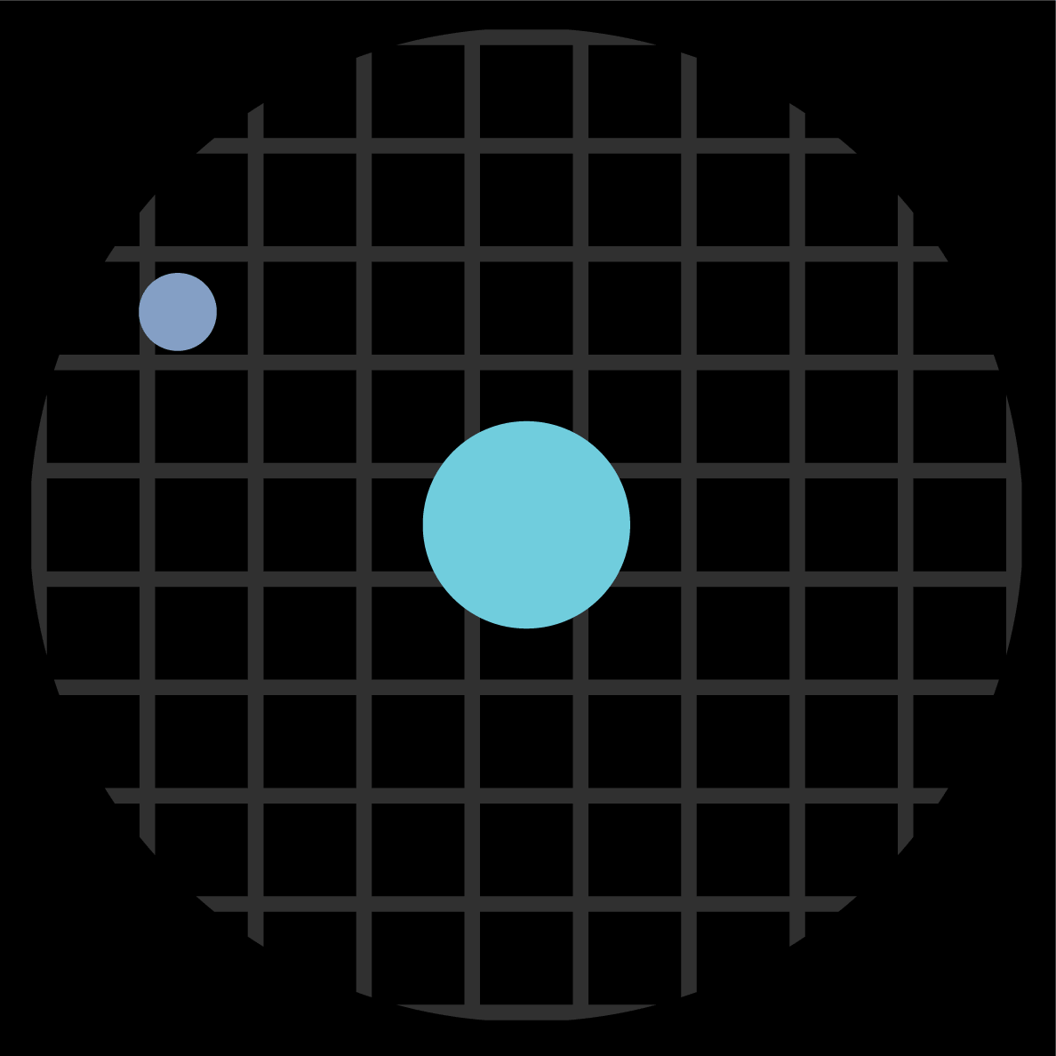
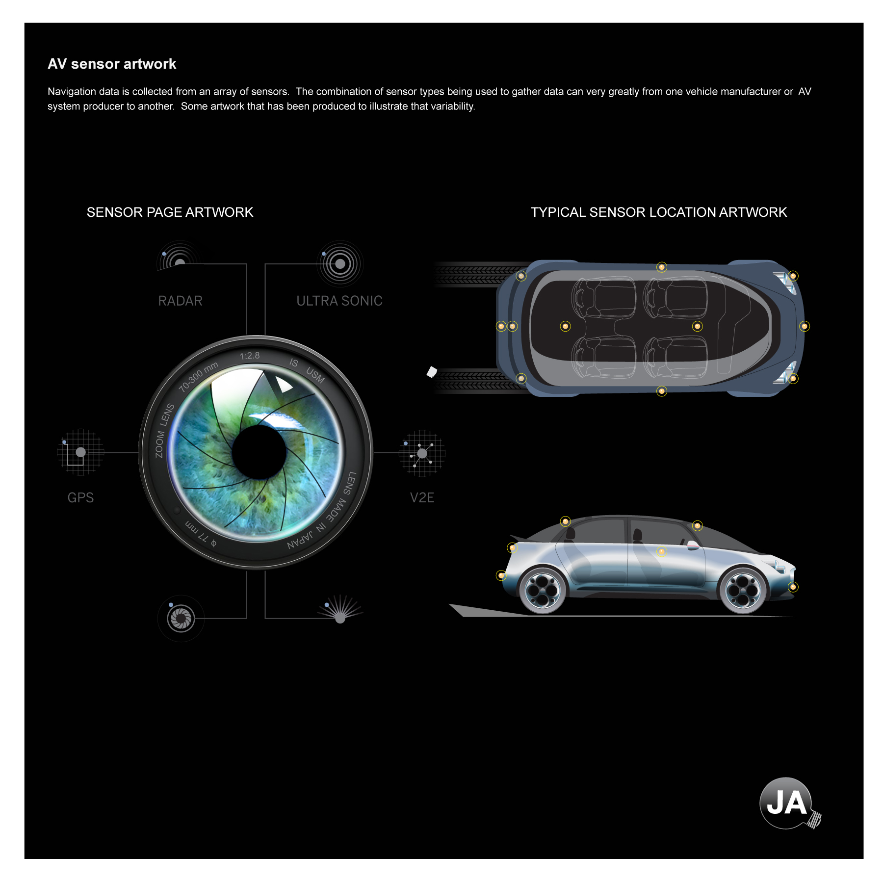
Drilling down on sensors
There is a finite set of sensors used by companies to create autonomous driving technologies. Often companies combine different types of sensors into arrays or sets. The sensor combinations used by companies could be distinct or common. The approach each company uses to process sensor data feeds is what makes each company unique. This panel established a uniform iconography set that could be used when discussing sensor technology. The icons could be static or animated.
Using motion strategically
Motion adds a unique dimension when conveying information and can be strategically used to add information value. The animated sensor icons were designed to be run with an overview explainer graphic on sensors. When bundled with a simple label, they could visually describe how a sensor worked with no supporting explainer text.
Bringing it altogether
This panel begins to illustrate how the color palette, typography, iconography, and guidance devices come together in a graphic.
Using alternative forms to explain
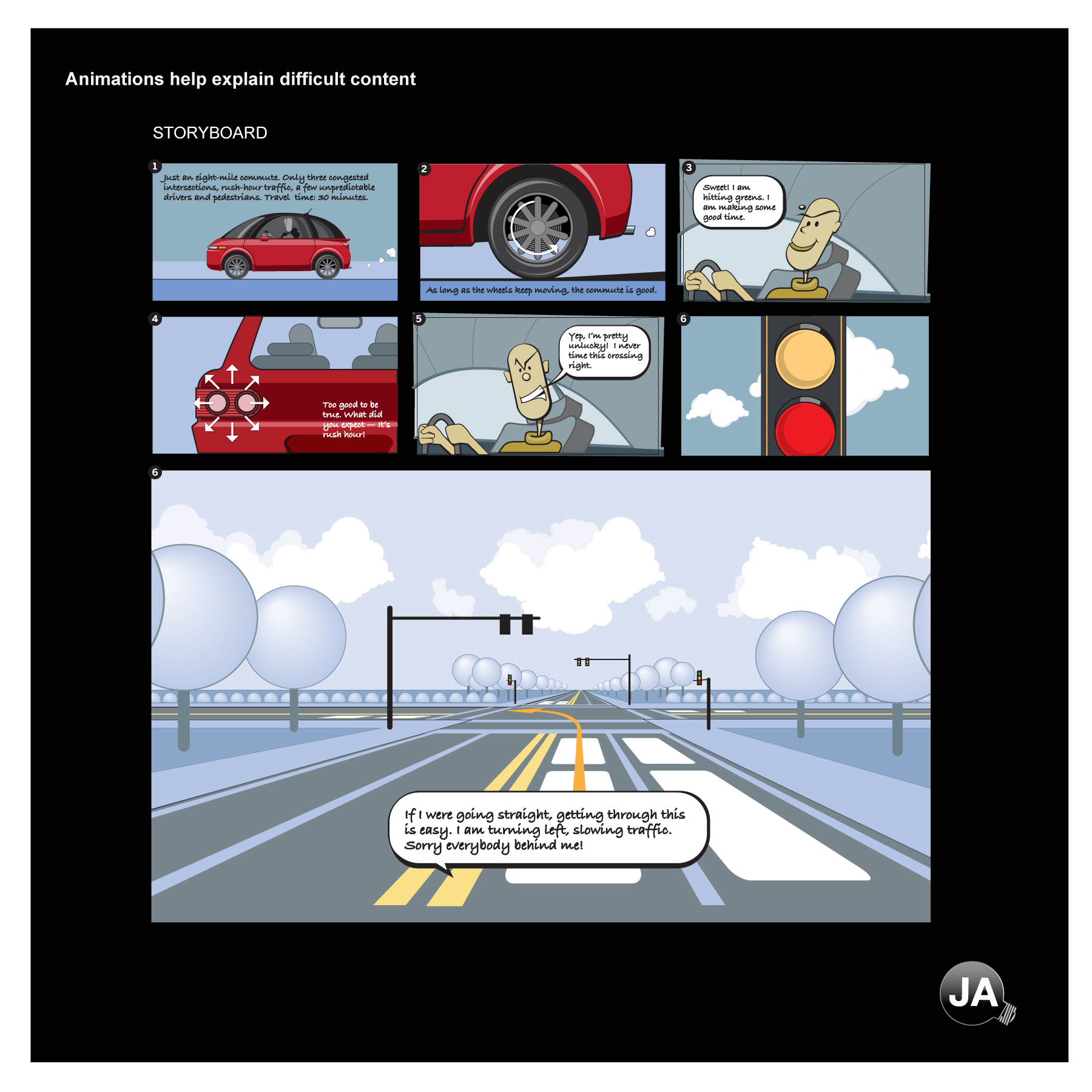
When automating navigation decision-making for autonomous land vehicles, making a left-hand turn safely into oncoming traffic is one of the most difficult maneuvers to program.
Sophisticated AI algorithms basically calculate the risks associated with making the turn based on sensory input. Considering there may be traffic in front of the vehicle, the oncoming traffic, pedestrian and cycle activity, the duration of the green signal light, it‘s a challenge to plan for every potential scenario in real time and tell the car when to safely begin the turn.
An animation was suggested to help readers appreciate the difficulty of creating software that could safely turn left or perform other difficult maneuvers. The approach here was like how Disney explained Dino DNA in an animation in Jurassic Park. The storyboard described how a left turn was processed from human driver‘s perspective. When you look in detail at all the individual decisions a human makes in a few seconds before they turn, you begin to appreciate the challenge of doing the same with artificial intelligence.