Getting noticed at the convention
During the first four months the objective was simple: Create a multimedia display for a planned trade show in May at the Greater Boston Convention & Visitors Bureau. Because Autonodyne is a software company, there wasn’t much to hand out other than branded giveaways. However, there was a lot to show and talk about.
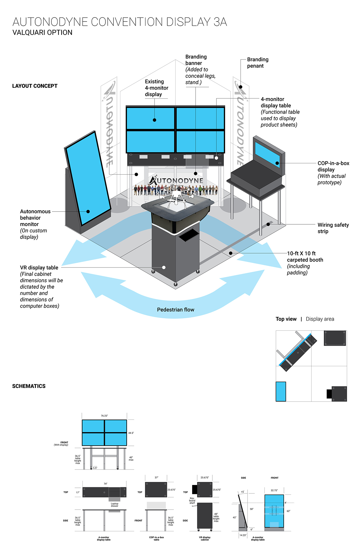
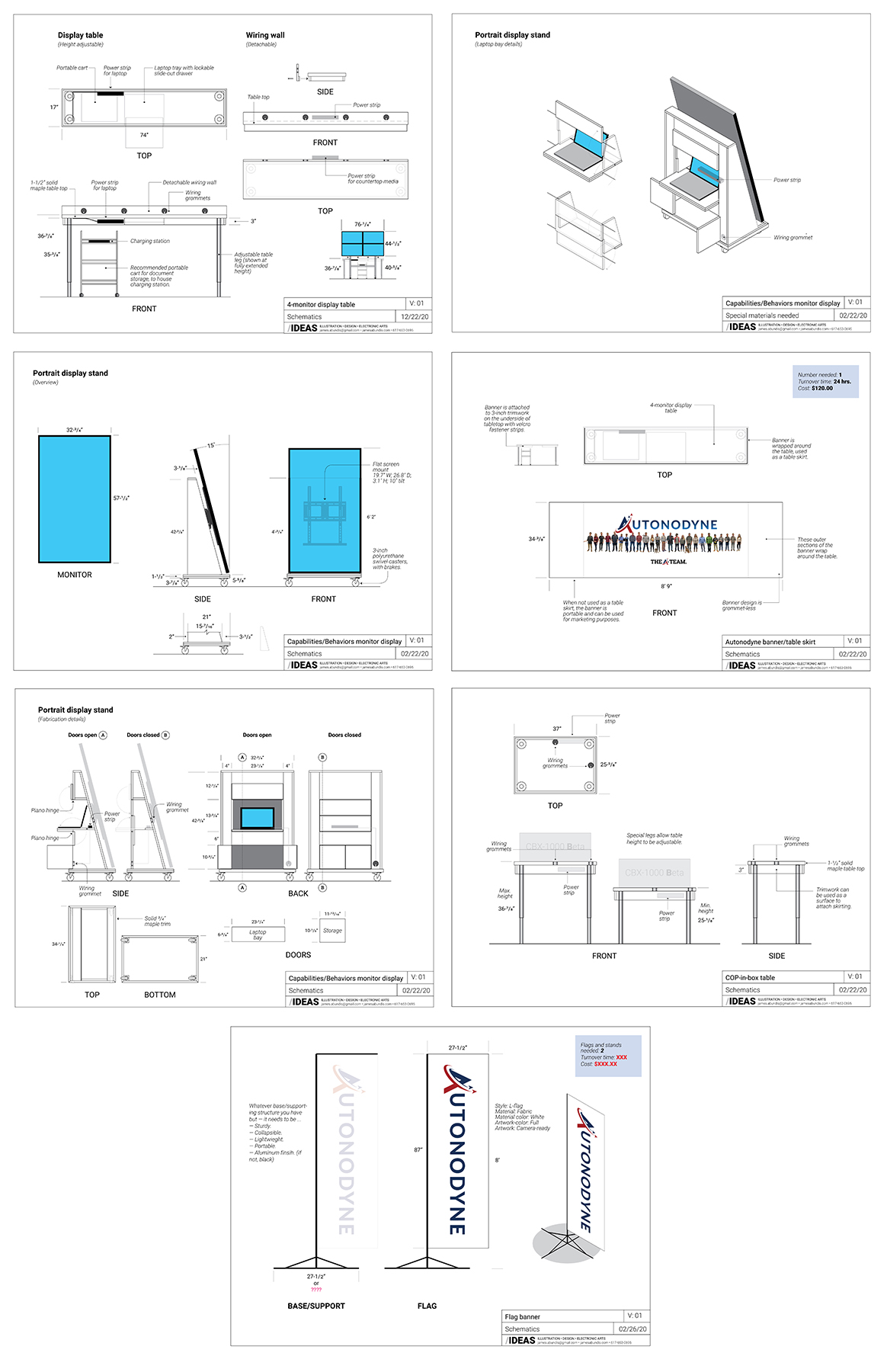
The final convention display chosen out of four prototypes, the planned media displays, and schematics to build the displays.
Final display prototype

Construction blueprints

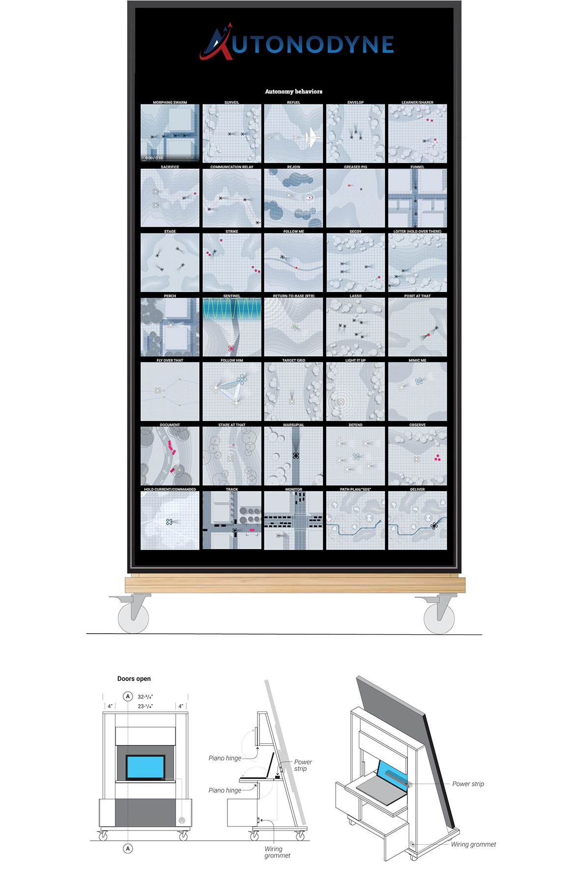
Autonomous behaviors display

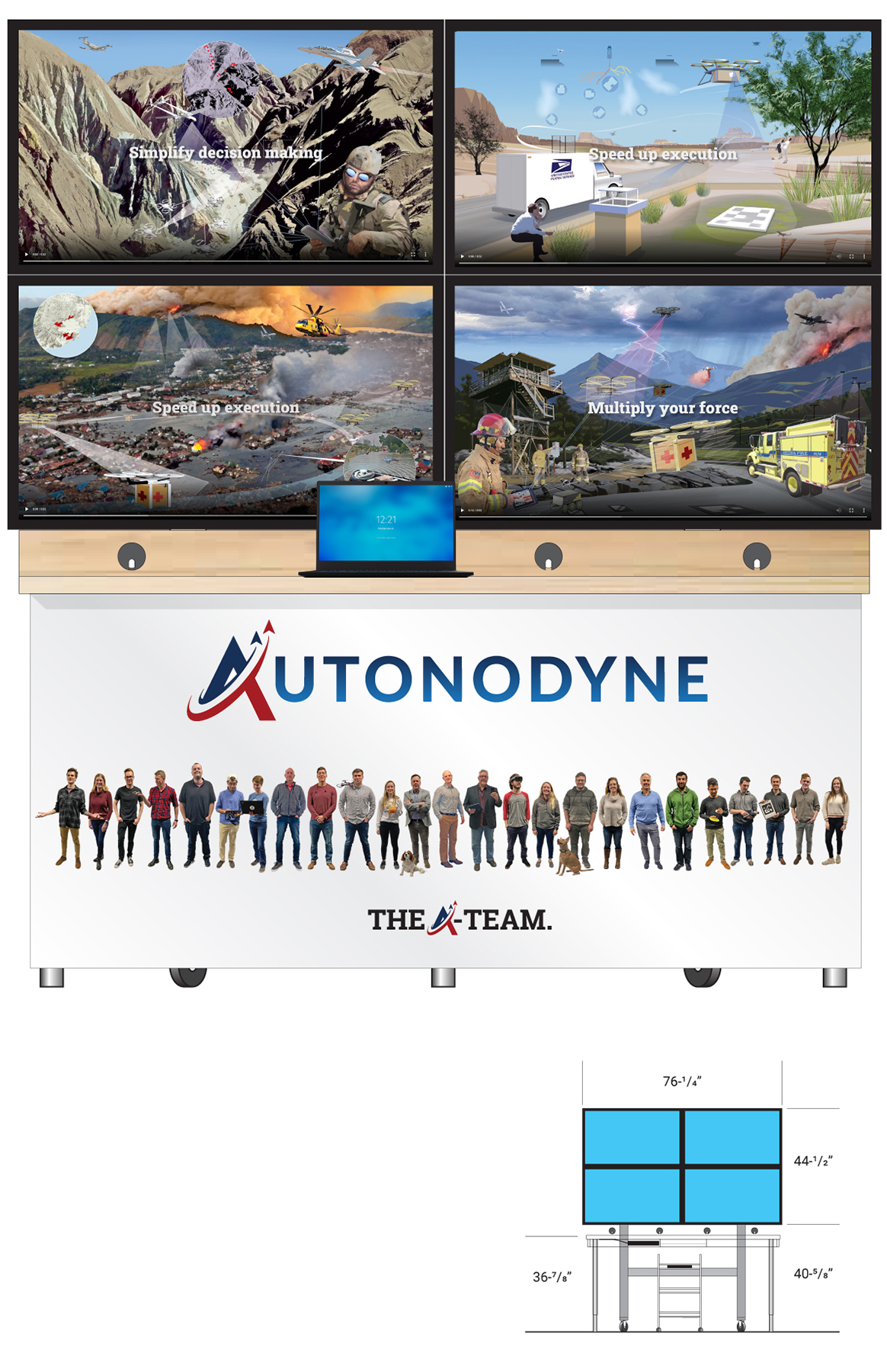
Autonomy scenarios display

Best to animate, explain visually
Thirty-five 10-second autonomy behavior animations were created for a touch-sensative, high-resolution video monitor. The display was designed as eye-candy to stop conventioneers in their tracks or at least get them to pause and look. Each animation showed simply and precisely what the behavior did without any words. However, viewers could also interact with the display by touching an animation to get additional information.
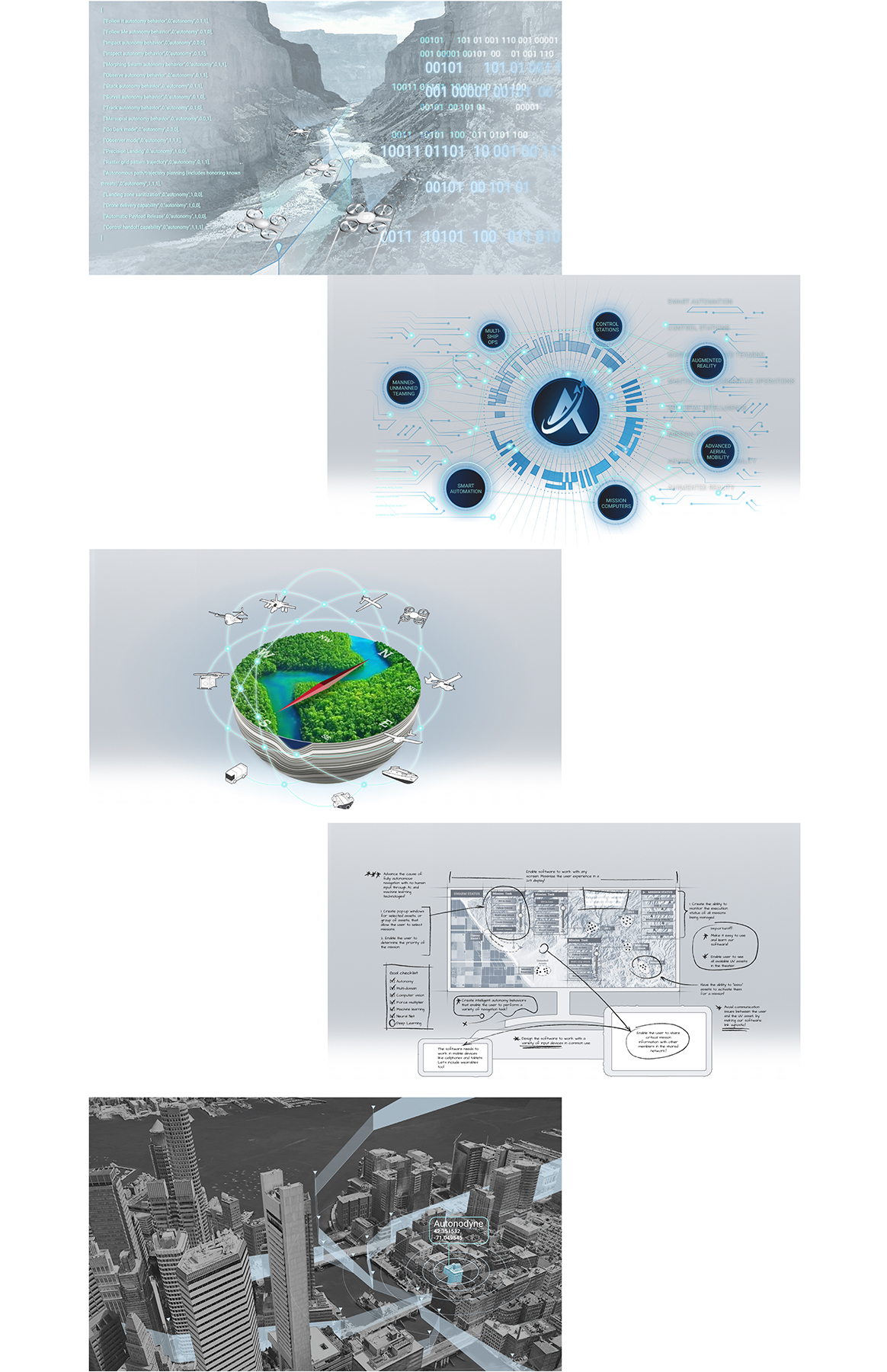
Four of the animations:
Best to show then tell
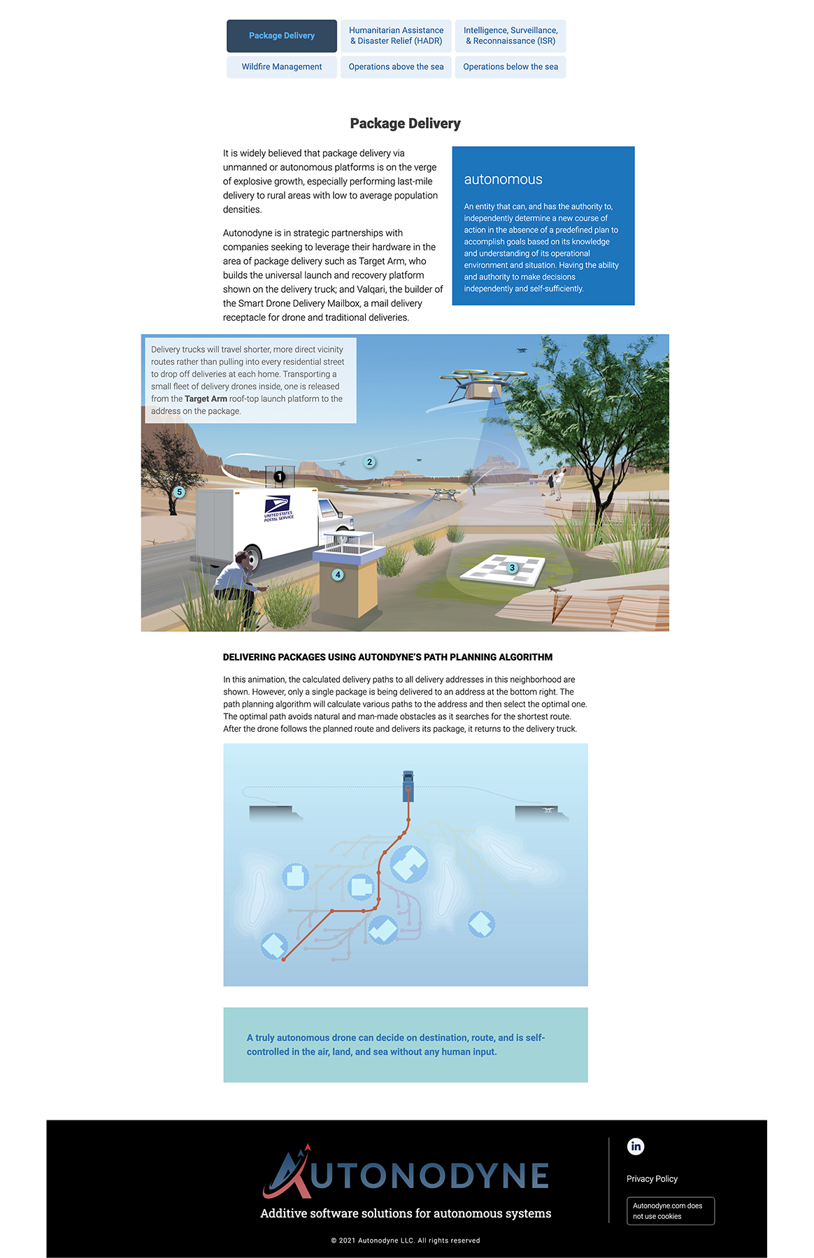
The autonomy scenarios were a different story. Different behaviors can be bundled to enable mission-specific tasks to be performed. The number of mission possibilities seemed endless. Autonodyne focused on displaying four distinct autonomy scenarios showcasing how their software worked on a four-monitor display. All four videos were 35 seconds long and collectively looped in sync. A few presenters were staged near the display to describe how their software could, for example, help deliver packages.
For the web, a still was taken from each video to serve as a backdrop for a tooltip interactive. Also, two additional scenarios were later added.
The forest and package delivery autonomy scenes in this graphic are complete digital paintings. The other four scenes are part painting, part photo mashup.
Presentation help in down time
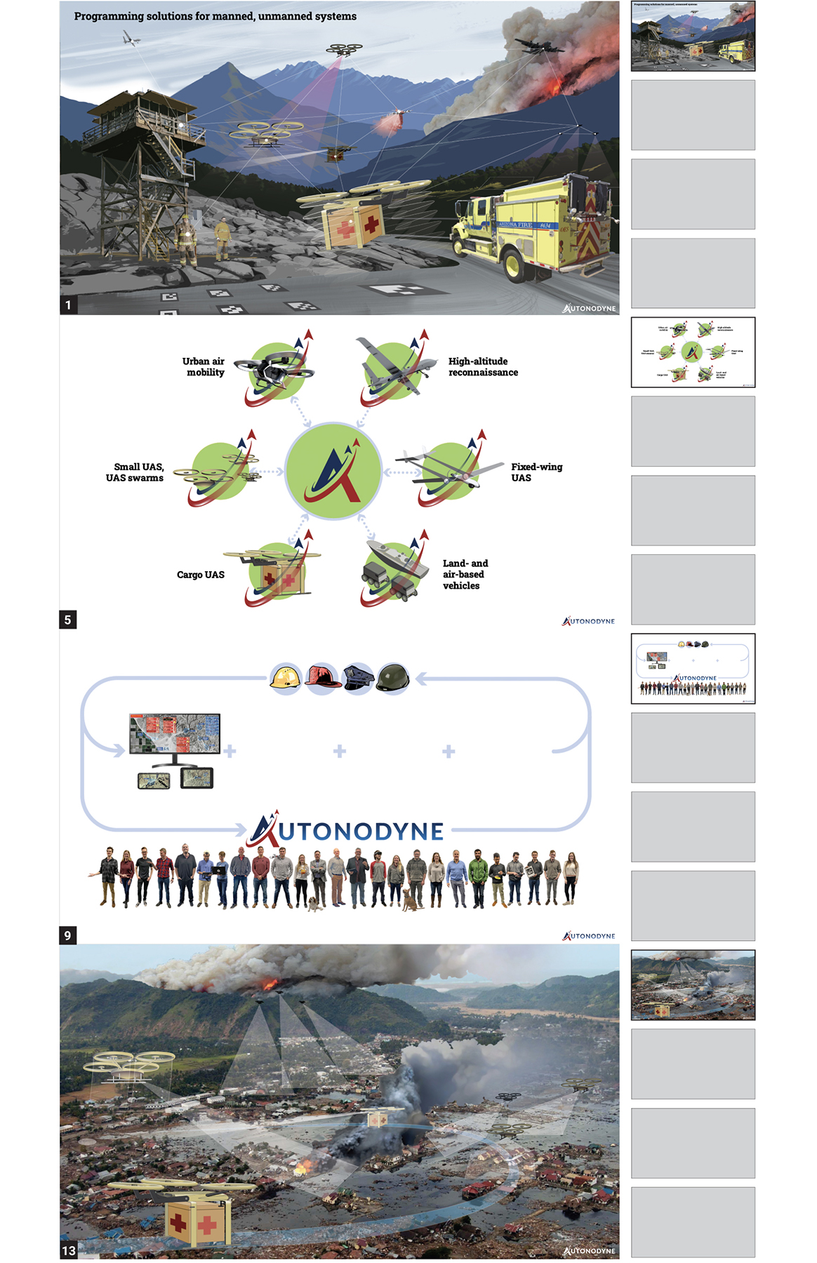
A slide deck was created for an international innovation competition in France during a brief slow period. Because of the pandemic the presentation would be given virtually rather than in person. Consequently, the slide show had to work harder to make key points since all eyes would be on the presentation. Only four slides could be used during the presentation that was capped to five minutes in length. Besides that limitation, there were no limits on transitions. So, we aded at least four to each slide to give the presentation more depth, life. In the end we had few copy with memorable imagery and graphics harmoniously orchestrated over a rather brief period of time. A good rule-of-thumb to follow for any slide deck.
Autonodyne ended up being a finalist.
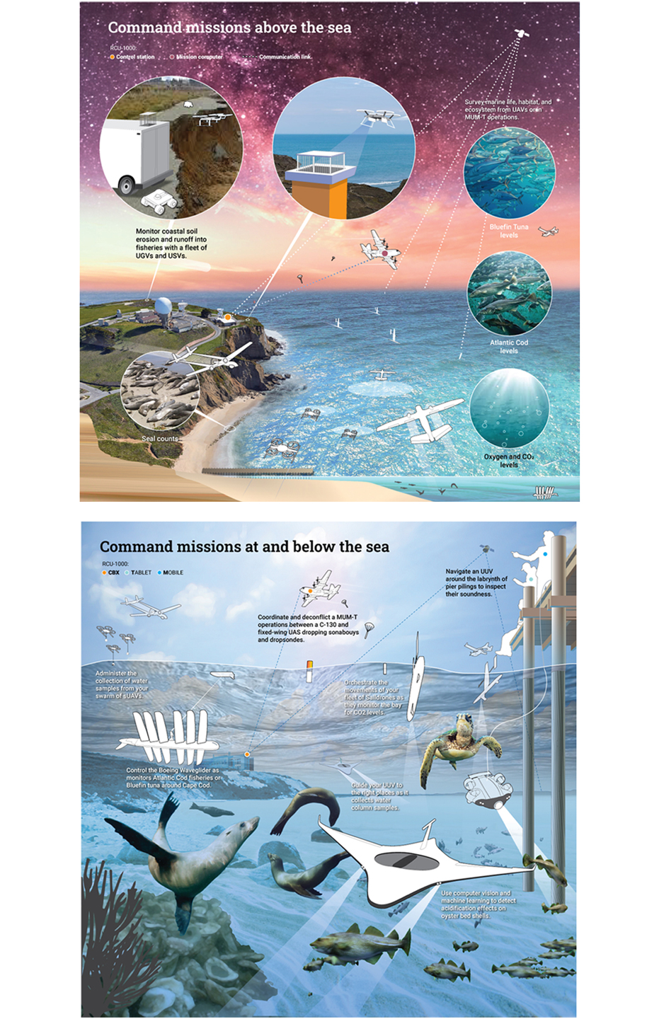
During the second leg of my work for Autonodyne, I helped the CEO illustrate a sales presentation on two new autonomy scenarios. This diorama below is looking at the same scene from above and below the water level. These scenes were later wrapped into the autonomy scenario web interactive.
Conceptual llustrations and graphics help
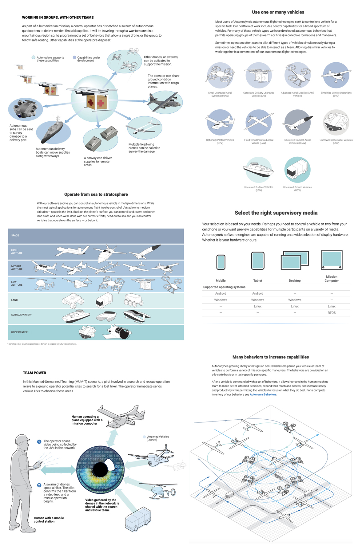
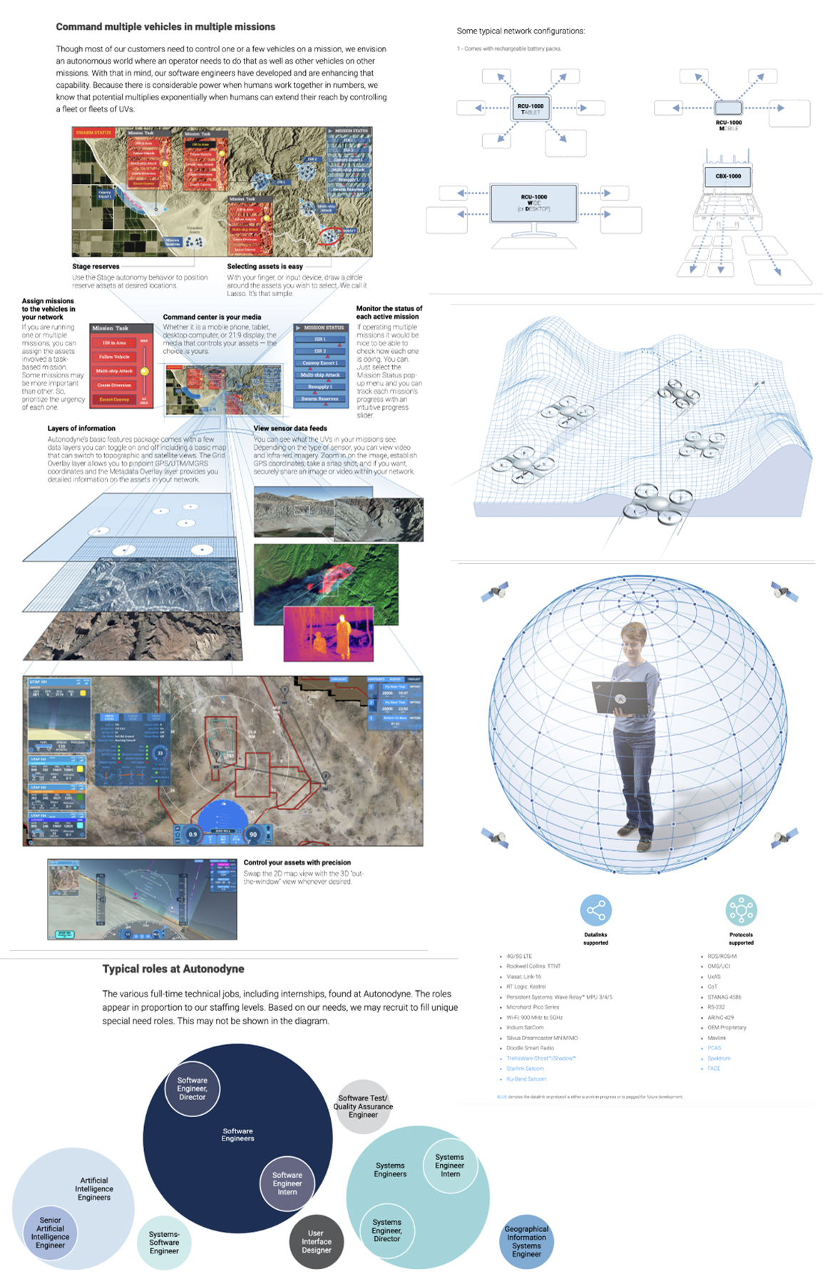
Though you can’t see software working you can easily describe and illustrate its benefits. Equally challenging when trying to promote a complex product is explaining how it works. Both things needed to be done to show and explain the work Autonodyne does. Those challenges made this project exciting.
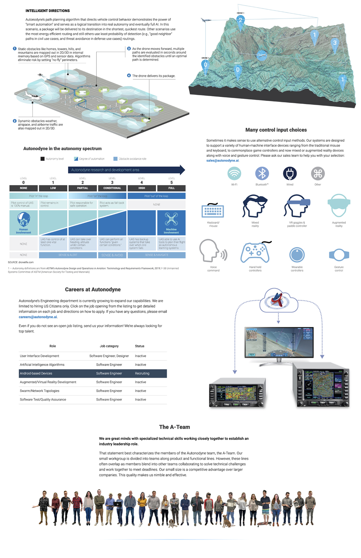
Some of the other finished illustrations and graphics published on the website.

